Multi-state
The Multi-State component in PandaSuite allows you to manage animations on individual objects or groups of objects.
It is ideal for creating interactive effects such as buttons with different states (normal, hover, clicked), appearance effects, or transformations of visual elements. For more global animations that affect the entire screen, it is preferable to use screen states or foregrounds.

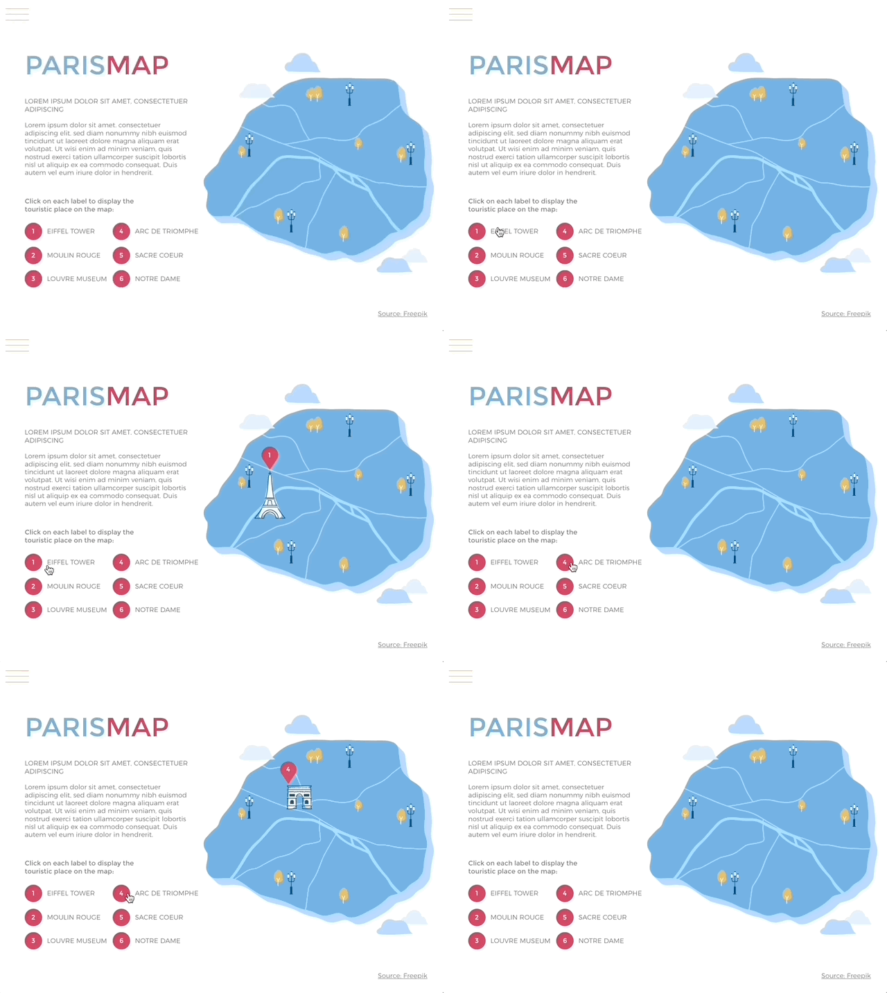
In the example above, the Multi-State component includes 2 states:
- The first state where the content of the popover is present but not visible (opacity at 0%).
- The second state linked to the first, where this content becomes visible (opacity at 100%). The Multi-State transitions from one state to another when the button is clicked.
It is essential to master transitions and related states to create animations using the Multi-state component. We recommend reading this article beforehand: Transitions.
Use cases
- Interactive buttons: create buttons with different visual states (normal, hovered, clicked).
- Appearance/disappearance effects: animate objects to make them appear or disappear smoothly.
- Element transitions: manage changes in shape, size, or color of an object.
- Local variations inside an interface: a card that flips, a panel that switches between “empty” and “filled”, a section that toggles between “preview” and “details” without affecting the rest of the screen.
Setting up the component
- Click on Components and choose Multi-State.
- Place the component wherever you like on the canvas.
- Double-click inside the component area to edit the content: a first state is automatically created.
- You can insert any type of content inside: images, shapes, text, and even other components.
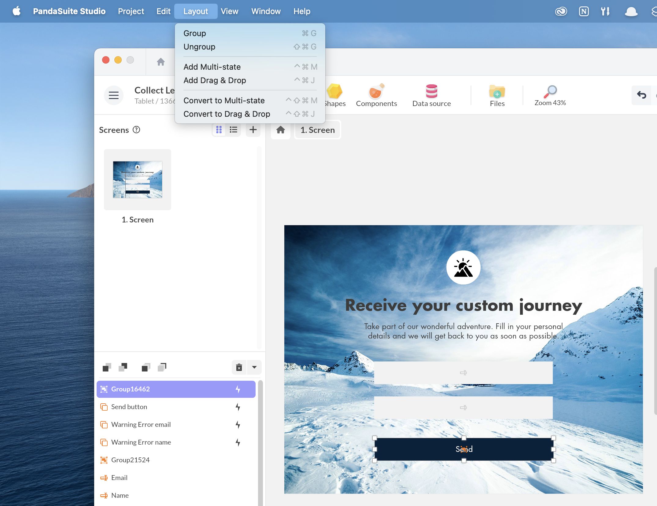
You can also use the Convert to Multi-State option available from the application menu (Layout > Convert to Multi-State) to transform an existing group of elements into a Multi-State component.
Adding new states
To create appearance and transition effects, it is necessary to create new states. If you want a transition between two states, they must be linked.
To add a new state:
- Make sure you are inside the component.
- Go to the component’s editing area on the left side of the screen.
- Click the + button to add a new linked state and use the dropdown arrow to choose between a linked or independent state.
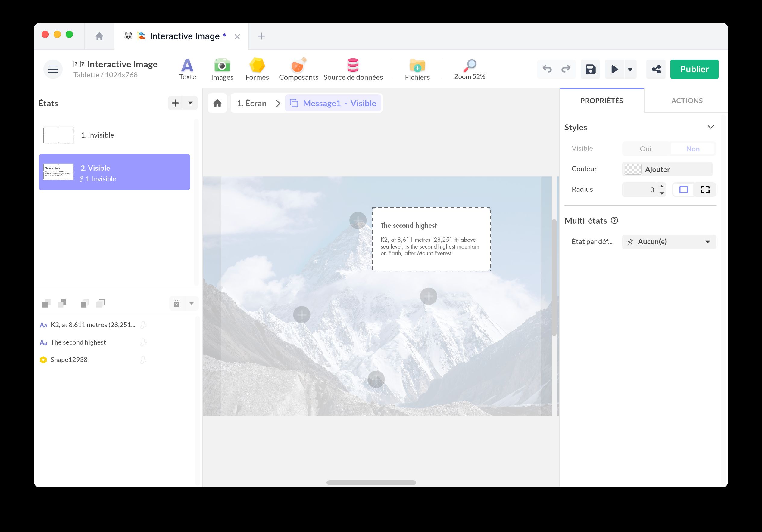
You can create an unlimited number of states and navigate between them from the left panel.
Component features
Default state
In the properties panel, you can select a default state, which will be automatically displayed when the component loads. If you do not set anything, and the user returns to this screen, the component will display the last shown state.
Trigger events
To trigger an action from the Multi-State component, select the component and open the Actions window. In addition to standard triggers (Tap Click, Mouse Enter, Key Press…), you can trigger an action when each state is displayed. This allows you to change the state automatically without user interaction.
Interactive actions
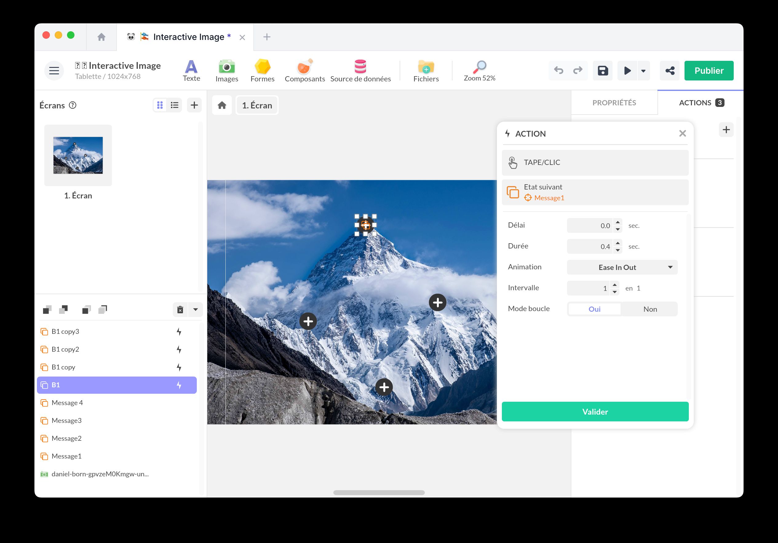
To interact with this component, select a trigger (e.g., a button) and choose the Act on a Component action. Select the Multi-State component, and you can choose from the following actions:
- Select a State: Choose a state from the list.
- Next State: Set an interval and enable Loop Mode.
- Previous State: Set an interval and enable Loop Mode.
- Random State.
To trigger an action from the Multi-state component, select this component and open the Actions window. In addition to the standard triggers (Click, Mouseover, Key…), you can trigger an action upon the display of each state. This way, you can automatically change the state without user interaction.
Best practices and tips
We recommend renaming each state clearly to simplify navigation and management.
Keep independent behaviors on separate Multi-states
A Multi-state always shows a single current state, and that state is the full snapshot of a moment: switching to a state applies everything recorded for it at once. This is what lets you animate many properties together, but it also means a single Multi-state can only represent one thing at a time.
When the same element must reflect two behaviors that change independently, one Multi-state is not enough. Take a tab bar: each tab has an active or inactive look that changes on every navigation, and one tab may also show a notification badge that depends on live data. If a single Multi-state drives both, switching tabs resets every tab to its inactive look, and the badge disappears with it, because the component can only display one state at a time and the inactive state does not carry the badge.
Give each behavior its own Multi-state, so each keeps its own current state:
- One Multi-state for the active or inactive look, driven by navigation.
- A separate Multi-state for the badge, driven by your data (for example with a Condition component or a binding).
Changing the active tab never touches the badge, and updating the badge never changes the active look.
When the second element sits on the first, like the badge placed on the tab, nest its Multi-state inside the tab. When the parent changes state, it re-applies position, size, and appearance to the objects it shares across its states, but it does not reset a nested Multi-state: the badge keeps its own state while the tab moves or restyles around it. For this to work, keep the badge as the same shared object across the parent states (use linked states) rather than a separate copy in each state.
Examples of using the Multi-state component
Hover button
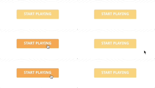
Create two linked states and create a state change action on mouseover and another on mouseout.
Toggle

Create two linked states and create a state change action on click.
Drop-down
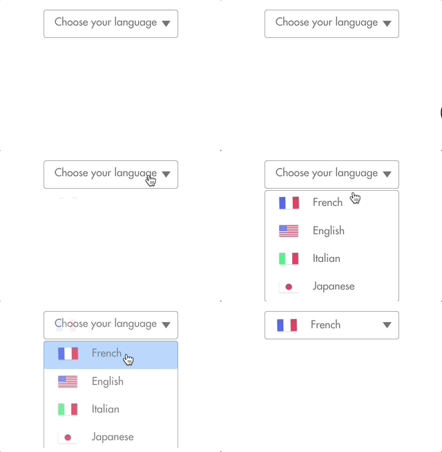
Pop-over