Flexbox
The Flexbox component arranges its children along a main axis — horizontally or vertically — and automatically resizes them to fit the available space. It is the go-to layout for responsive interfaces, especially on phones and tablets.
Pair it with the Responsive option to adapt the display across screen resolutions without redefining each element’s size or position.
Use cases
- Dynamic text and translations: lay out text blocks whose height varies with the data or language — the Flexbox repositions the following items automatically.
- Scrollable lists of authored cards: stack hand-designed sections or cards vertically and let the Flexbox manage the scroll size when the screen overflows.
- Responsive grids: combine a horizontal orientation with Wrap children to flow items into a multi-row grid that adapts to the screen width.
- Section-based scroll experiences: anchor markers on key children to fire events or jump the layout to a precise section as the user scrolls.
What is Flexbox layout?
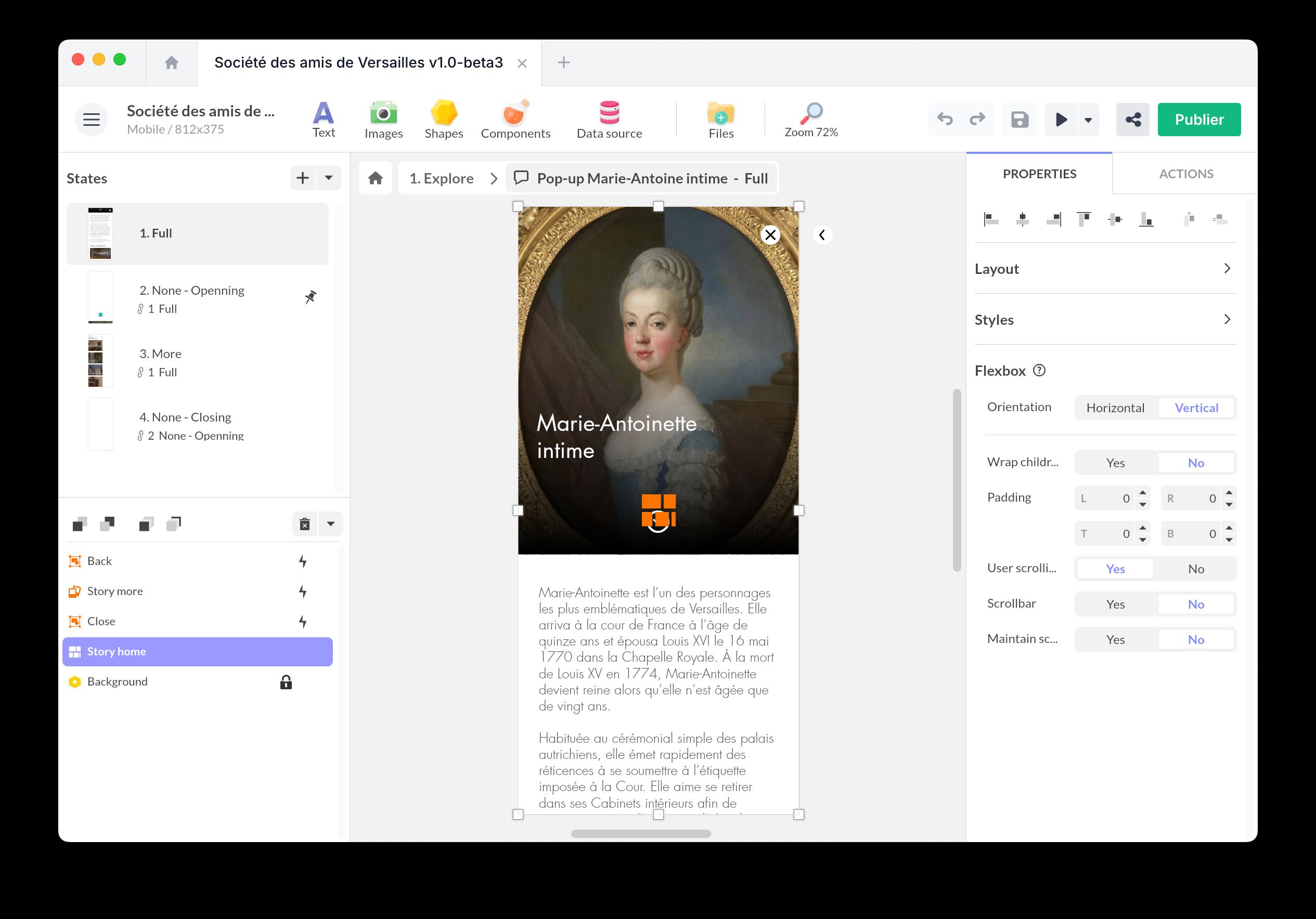
Flexbox is a layout model based on a main axis. Elements arrange themselves fluidly along that axis — horizontally (side by side) or vertically (stacked from top to bottom) — and the container automatically adjusts each item’s size to fit the available space.
Inside a Flexbox, items follow the order of the layer list. To reorder them, move them in that list. When a child grows or shrinks (typically because its text content changes), the Flexbox repositions the following items accordingly, which keeps responsive and dynamic content tidy.
Children can be plain objects or wrapped in a Group component to inherit shared sizing rules.
Need to keep a dynamic text centered as it grows or shrinks? Wrap a single text bound to your data inside a horizontal Flexbox with Wrap children disabled — the Flexbox keeps it vertically centered without any manual repositioning. Switch the orientation to vertical to center horizontally on the same principle.
Insert a Flexbox
Click on Components and insert the Flexbox component.
Place it where you want your elements to appear. Inside, insert your children directly or wrap them in a Group component for shared sizing rules.
In the Properties panel, you can configure:
- Orientation: choose Horizontal or Vertical for the main axis.
- Wrap children: lets elements flow onto a new line (or column) when the main axis runs out of space.
- Padding: set the inner padding of the container with L, R, T, and B values for left, right, top, and bottom.
- User scrolling: enables the touch or mouse gesture for scrolling the layout when its content overflows.
- Scrollbar: shows or hides the scrollbar.
- Maintain scroll position: keeps the user’s scroll offset when they leave and come back to the screen.
Enable User scrolling on the Flexbox when the scrollable size should be calculated from the layout itself: children can wrap, resize, or grow with their content, and the Flexbox redistributes the following elements accordingly. Use a Scrolling Area when the scrollable content is a self-contained region with a visible area sized separately from the surrounding layout.
Create markers
Markers on a Flexbox are anchored to a specific direct child. Use them to trigger actions when an item enters the visible area, navigate to a precise landing position, or synchronize the layout with another component. See the Markers overview for the general concept.
To create a marker:
- Enter the Flexbox in edit mode.
- Select the direct child you want to anchor the marker to.
- Click the + button in the marker list, then choose Create marker from selected item.
The marker stays attached to that child even when the order changes — it tracks the item itself, not its position in the list.
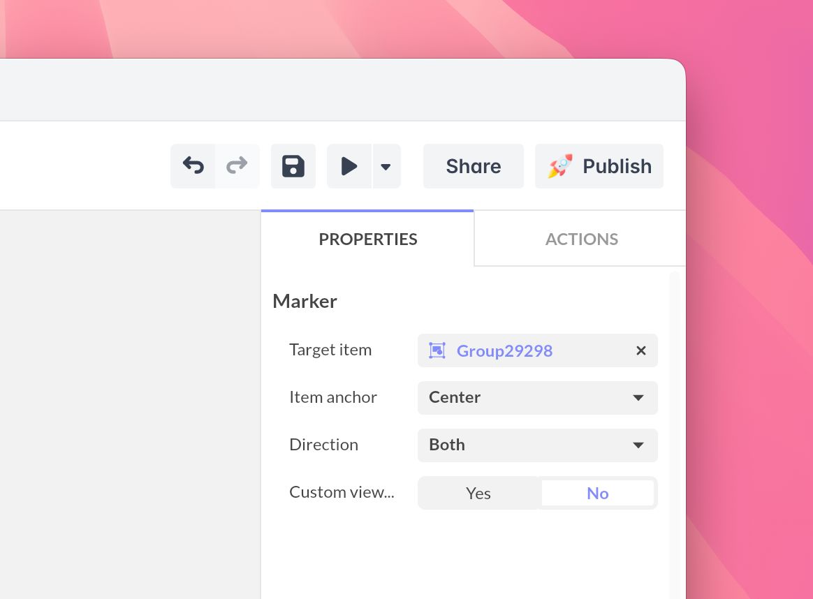
Marker properties
Each Flexbox marker exposes:
- Target item: the child the marker is bound to. You can reassign the target later from the marker properties.
- Item anchor: the reference point on the target item — Top, Center, or Bottom for a vertical Flexbox; Left, Center, or Right for a horizontal one.
- Direction: filter when the marker fires — Forward, Backward, or Both.
- Custom viewport anchor: when set to Yes, choose a dedicated Viewport anchor for where in the visible area the crossing is detected. When set to No, the viewport anchor mirrors the item anchor.
Hover a marker in the list and click the Pin icon to make it the default position: the Flexbox opens with that item already aligned in the visible area.
Triggers
Choose your trigger from the list:
- Positions [markers]: each anchor marker fires when the item it is bound to crosses the viewport, in the configured Direction. Use it to start an animation, switch a Multi-State, or load related content as the user scrolls past the marker.
- Tap / Click
- Double tap / click
- Touch down
- Touch up
- Swipe up/down/right/left
- Mouse over/out
Actions
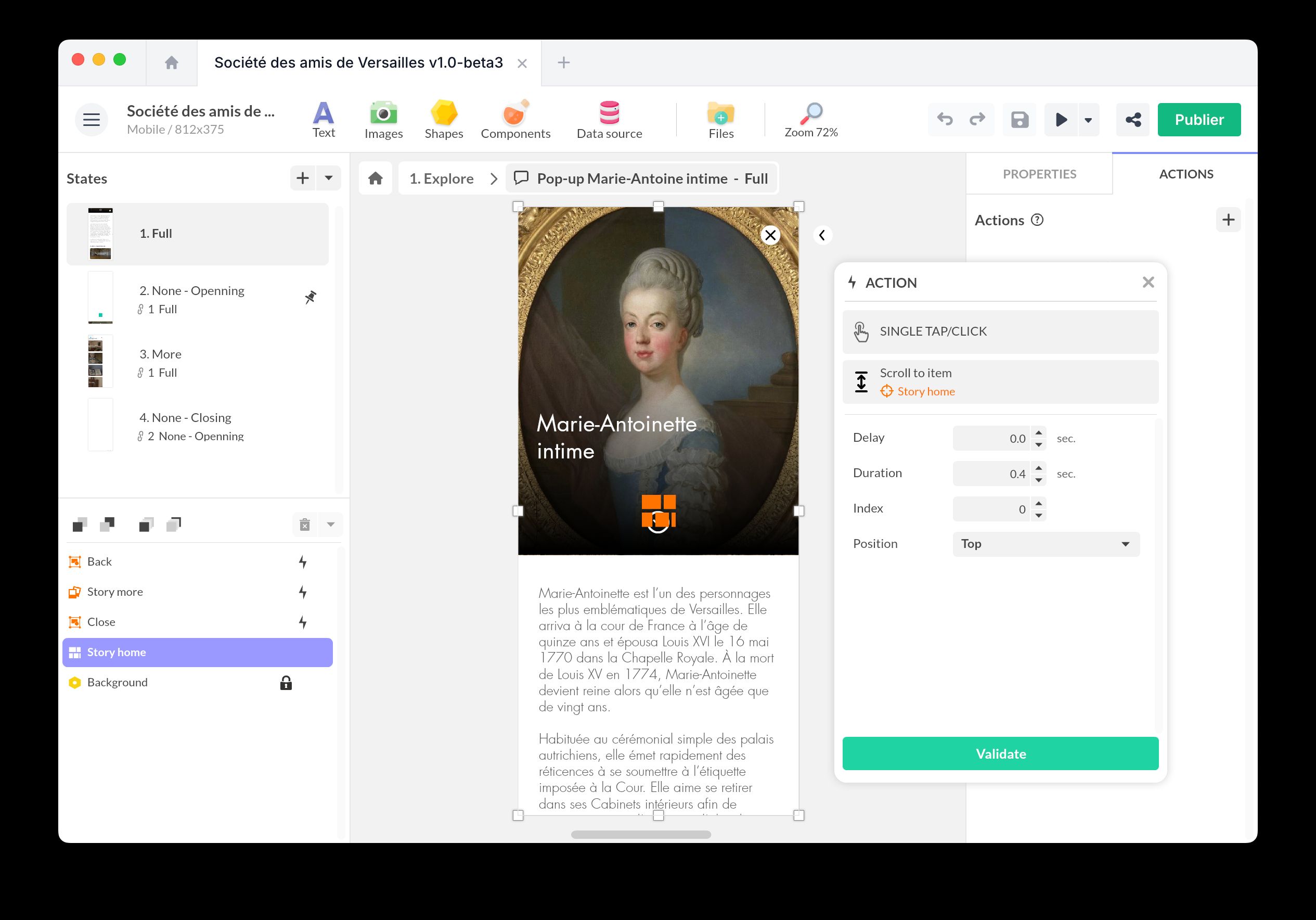
Scroll to item
Use Scroll to item to jump to a child by its position in the list, choosing where in the visible area it lands. No marker is required.
- Select the triggering object (e.g., a button).
- Add a new action by selecting Interact with a component > Flexbox > Scroll to item.
- Set the index of the target child, the landing position (Top, Center, or Bottom for a vertical Flexbox; Left, Center, or Right for a horizontal one), and the scroll duration.
Scroll to marker
Use Scroll to marker to bring an authored marker into view. Unlike Scroll to item, the landing position comes from the marker definition (item anchor and viewport anchor), so the same action gives the same visual result regardless of item size or list order.
- Select the triggering object.
- Add a new action by selecting Interact with a component > Flexbox > Scroll to marker.
- Pick the target marker.
Synchronize a Flexbox
Synchronization lets you bind a Flexbox to another component. The Flexbox exposes:
- Scroll position
- Markers
These parameters appear in the Properties panel of the Synchronization component.