Authentication
The Authentication component is designed to display sign-up and login forms in your application. It provides a turnkey visual solution, ideal for managing user access without having to build a custom interface.
This component can be used alongside the Firebase Session component to manage user sessions and data.
Insert an authentication form
Click on Components and select Authentication.
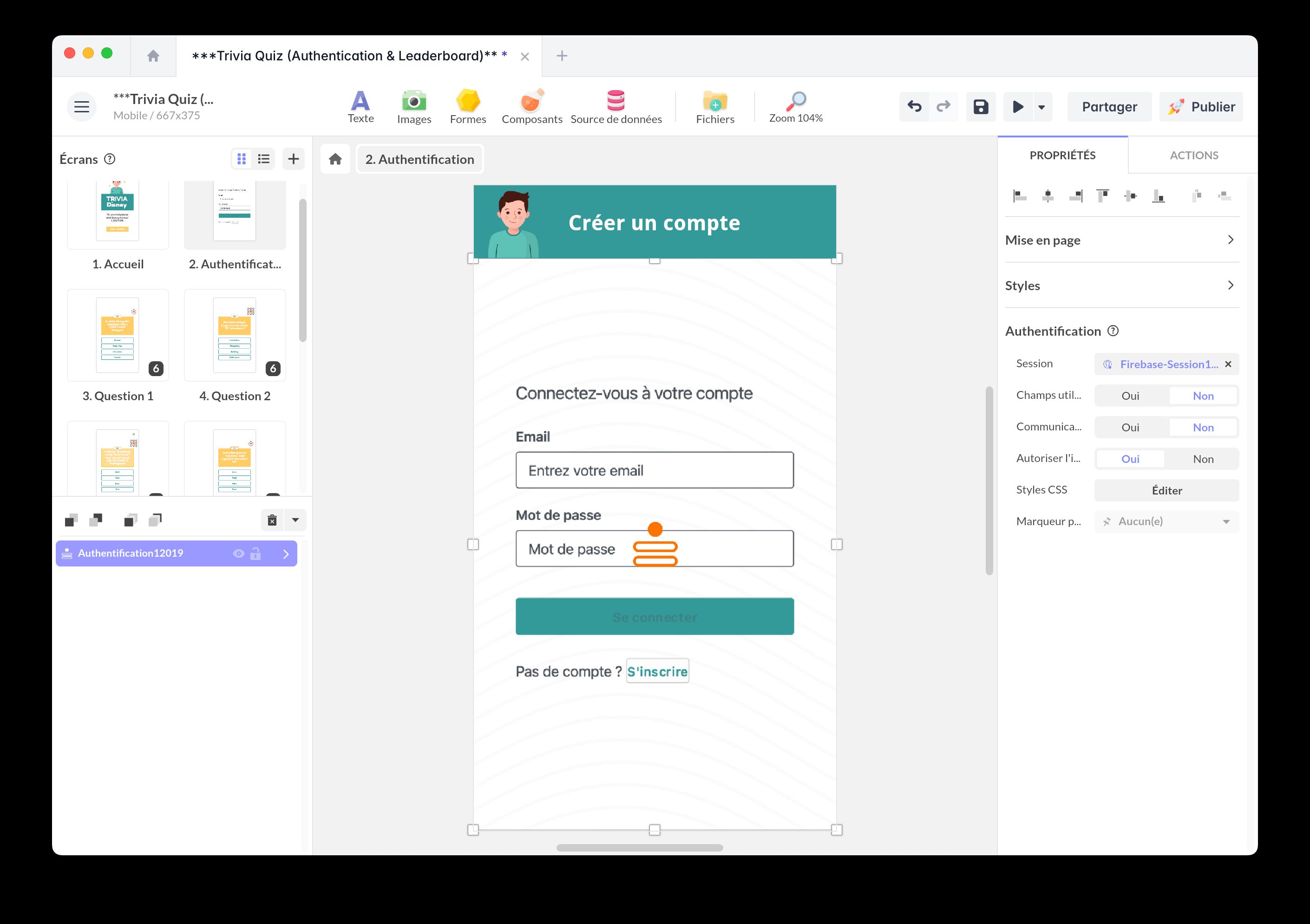
Beforehand, you must have inserted a Firebase Session component into your project. Link your Authentication component to it.
The Allow registration option lets you enable or disable the creation of new users.
Customize the fields
The Advanced user fields option allows you to add extra fields that are displayed in the sign-up form and then added to the user document during registration.
To customize the fields, click on Fields and open the JSON View.
If you also need to prepare the default structure of the user document, configure it in Default user data of the Firebase Session component. Values entered through Advanced user fields then complement that structure during sign-up.
Here is an example adding the fields Company, Job Title, Phone, Address, Postcode, and a checkbox:
[ { "label": "Company", "placeholder": "Enter Company", "locale_label": { "fr_FR": "Société" }, "id": "company", "fieldType": "text", "required": true, "locale_placeholder": { "fr_FR": "Société" } }, { "label": "Job Title", "placeholder": "Enter Job Title", "locale_label": { "fr_FR": "Poste" }, "id": "job_title", "fieldType": "text", "required": true, "locale_placeholder": { "fr_FR": "Poste" } }, { "label": "Phone", "placeholder": "Enter Phone Number", "locale_label": { "fr_FR": "Téléphone" }, "id": "phone", "fieldType": "text", "required": true, "locale_placeholder": { "fr_FR": "Téléphone" } }, { "label": "Address", "placeholder": "Enter Address", "locale_label": { "fr_FR": "Adresse" }, "id": "address", "fieldType": "textarea", "required": true, "locale_placeholder": { "fr_FR": "Adresse" } }, { "label": "Postcode", "placeholder": "Enter Postcode", "locale_label": { "fr_FR": "Code postal" }, "id": "postcode", "fieldType": "text", "required": true, "locale_placeholder": { "fr_FR": "Code postal" } }, { "label": "Tick to receive email updates from Marley", "placeholder": "", "locale_label": { "fr_FR": "Recevoir des communications marketing" }, "id": "opt_in_marketing", "fieldType": "checkbox", "required": false, "locale_placeholder": { "fr_FR": "Recevoir des communications marketing" } }]If you enable this option, make sure you have configured Cloud Firestore (see the Firebase Session article).
The Communications and usage terms option adds a checkbox for validating the terms of use. A new trigger event (Terms Clicked) is exposed on the Authentication component: it allows you to link an action in the user journey.
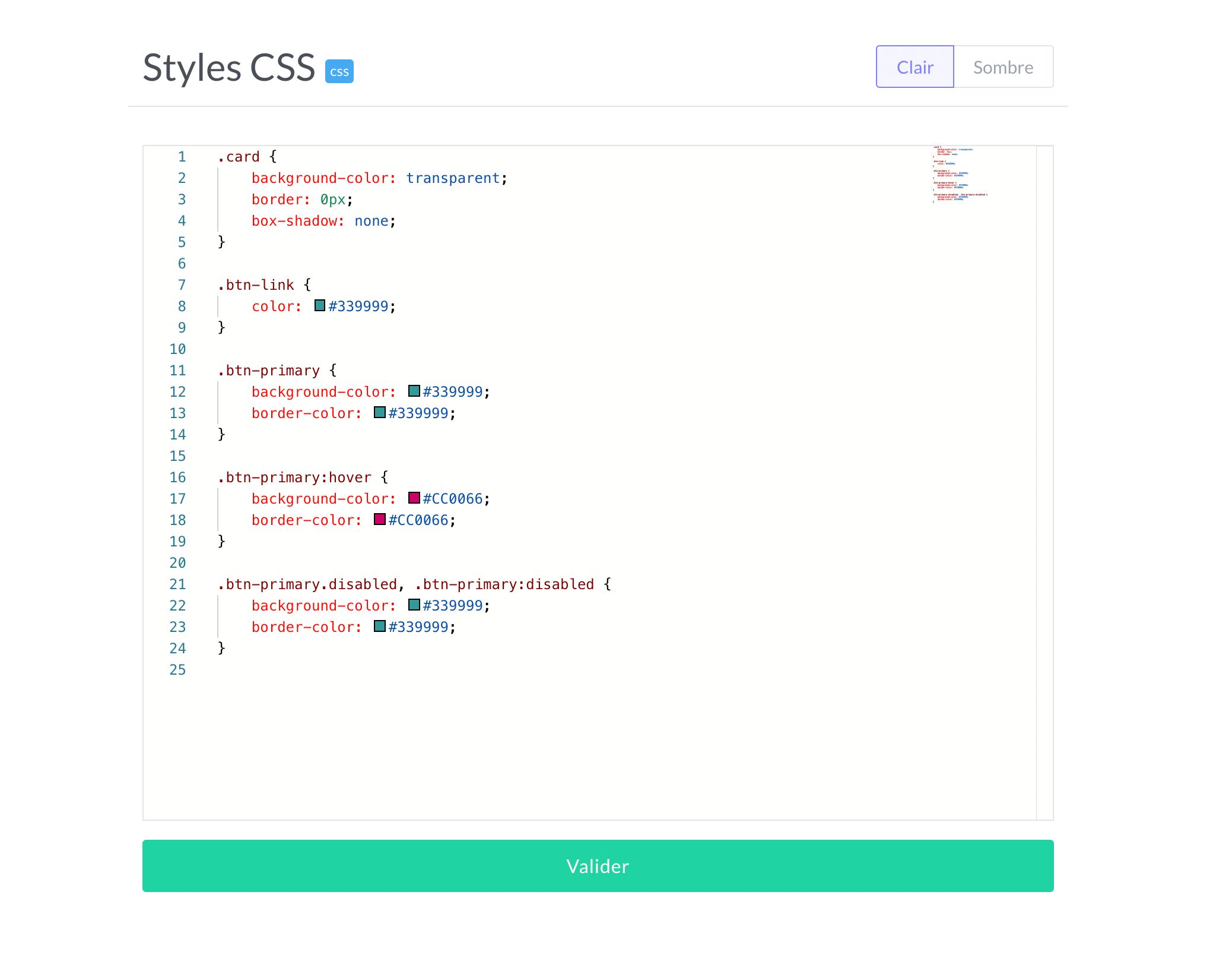
Customize style
You can customize the CSS style of the form by clicking the Edit button in the CSS Styles property.
If you want to go beyond the features offered by the Authentication component, you can build a fully custom interface using components such as Text Input. For this type of customization, including passwordless email-link sign-in, refer to the Firebase Session article, which explains how to create custom headless authentication.