Gallery
The Gallery component allows you to display a series of images or multimedia content in a dynamic and interactive way. It is ideal for designing portfolios, slideshows, image carousels, or product presentations. It can contain images, shapes, text, and even other components.
Use cases
-
Creative portfolios: Presenting visual or photographic projects.
-
Product carousels: Interactive displays of products with associated descriptions.
-
Animated slideshows: Illustrated presentations with integrated animations.
-
Audio guides or virtual tours: Navigating between various visual or multimedia points of interest.
-
Interactive catalogs: Browsing through a set of pages or images.
Setting up the component
Inserting into the project
Click on Components and insert the Gallery component.
Place the component wherever you want on your workspace.
Creating pages
The Gallery component is composed of pages. The user swipes with their finger or mouse to move from one page to another. By default, it contains a single page.
Double-click on the area to edit and add pages.
Click the + button to add pages.
You can insert all kinds of objects within the pages.
💡 The Gallery component can also be used to add a “slide” effect between screens. In this case, enlarge the gallery size to match your screen size and insert all your screen content within it.
Component features
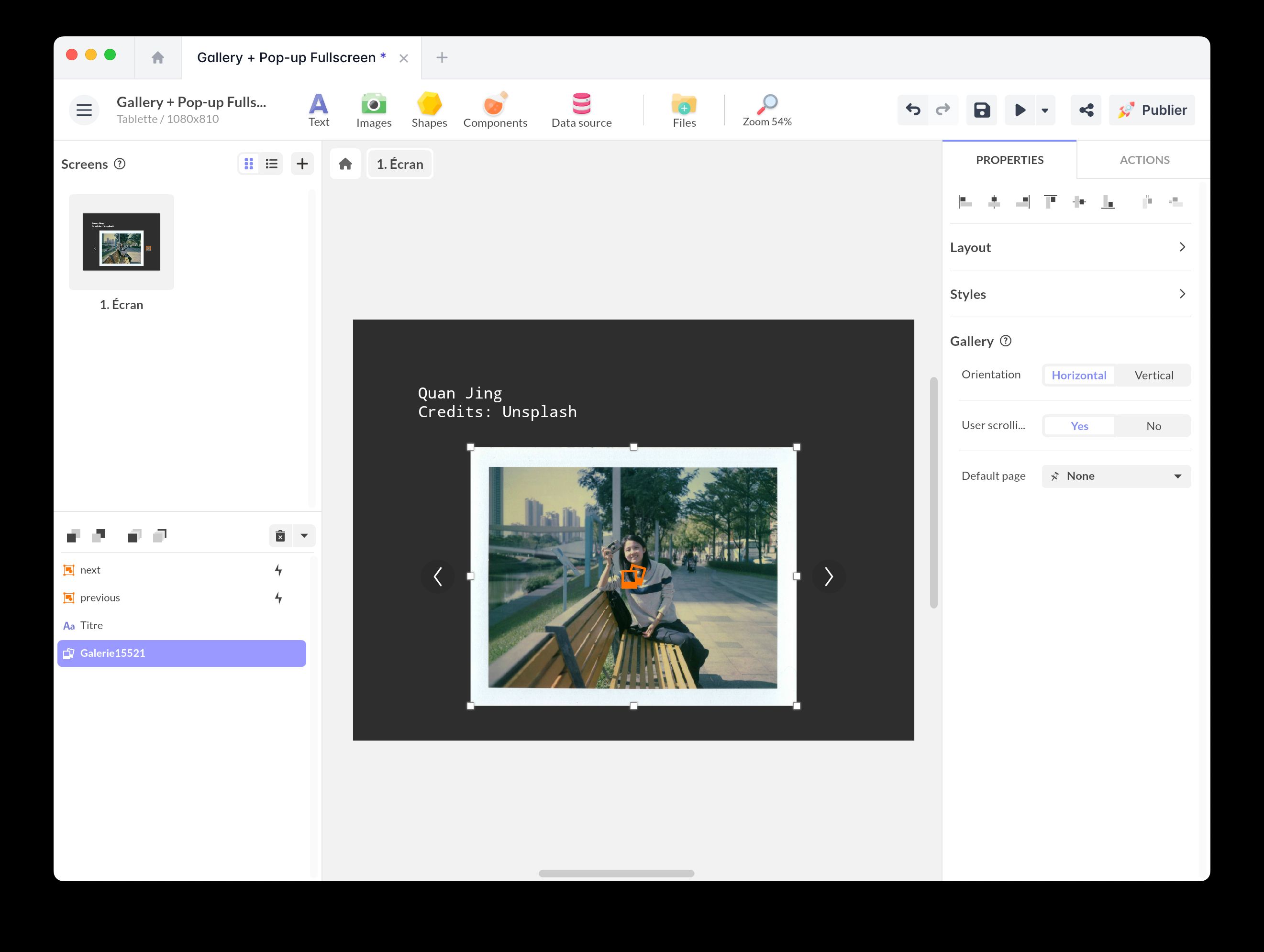
Properties
Here are the properties of the Gallery component:
- User interaction: This option enables user interactions defined on and within the component.
- Orientation (Horizontal / Vertical): Choose between horizontal or vertical scrolling.
- User scrolling (Yes / No): Enable or disable page scrolling by the user.
- Default page: Select the page that automatically displays when the gallery loads. By default, the gallery retains the last page.
Triggers
You can use the Gallery component to trigger an action.
Select your component and open the Actions window. Click + New Action to display the list of triggers:
- Display page
- Tap/Click
- Double tap/click
- Touch
- Release
- Swipe up/down/left/right
- Mouse enter/leave
Interactive actions
You can also create an action on the Gallery component.
Choose the trigger of your choice and the action Act on a component. Select the Gallery component, and here is the list of available actions:
- Select a page
- Go to next page
- Go to previous page
- Random page
Practical examples
Creating a button to navigate between gallery pages
Automatically scroll the gallery
To automatically scroll your gallery, you can add a Timer component and a Synchronization component to synchronize time values with gallery pages.
You can synchronize your gallery with any other component.
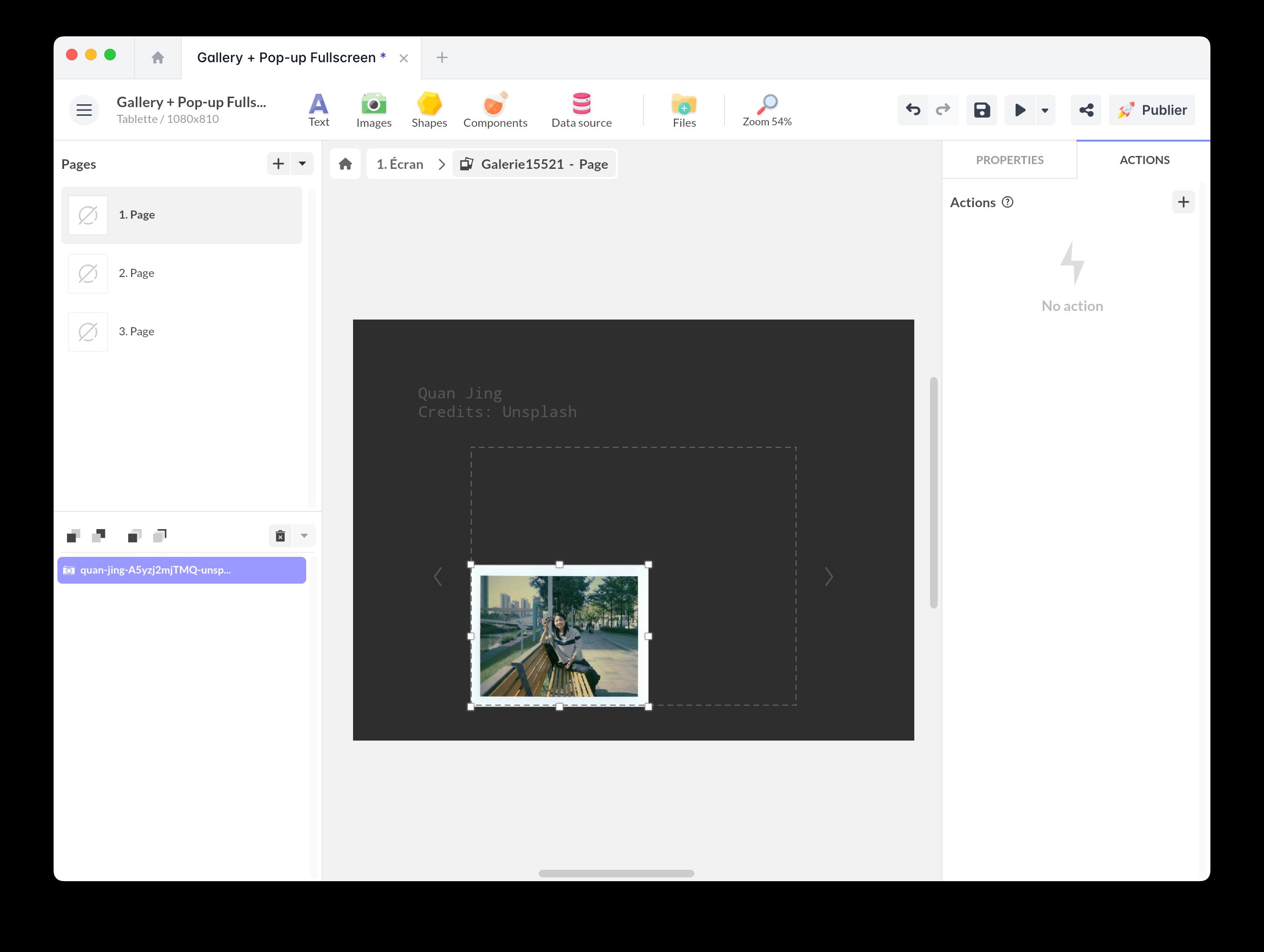
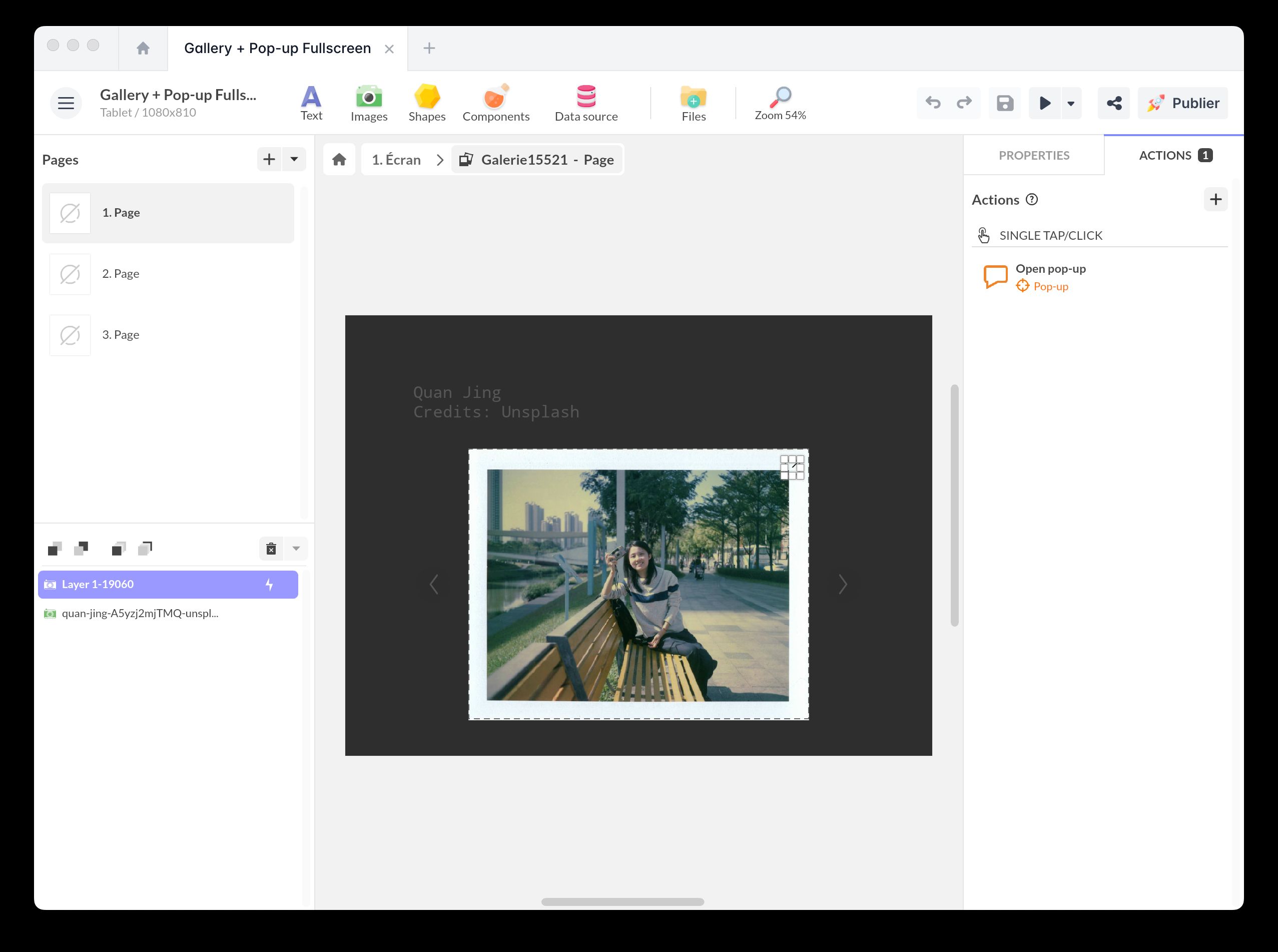
Open gallery images in full screen
If you want to open images in full screen, use the Pop-up component.
Place the interactive area of the Pop-up component over your image.
Gallery + Full-screen Pop-up
Add this template to your account in just a few clicks. Edit and customize it freely.
→ Add this template to your account