Responsive design
Learn how to create responsive screens that seamlessly adapt to all devices and screen sizes.
Introduction to responsive design
Responsive design is a web design methodology that ensures websites or applications automatically adjust to the user’s screen size, be it a desktop, tablet, or smartphone.
The default fixed layout
When you initiate a project in PandaSuite, it defaults to a fixed layout. This layout is designed based on a specific screen size ratio. While the project can expand, this ratio remains consistent regardless of the screen size. As a result, black bars might appear when viewing your application on a different screen ratio.
For an optimal user experience across devices, it’s crucial to enable Responsive mode. This ensures your design adjusts automatically to various screen dimensions.
Managing orientation
However, the responsive mode doesn’t account for changes in device orientation. For instance, if you’ve designed a mobile app in portrait mode but want a landscape layout for tablets, you’ll need to create a distinct layout.
Some components, like the Video component, can handle orientation changes. Alternatively, you can display a prompt encouraging users to switch orientations based on screen size conditions.
Activating responsive mode
To enable responsiveness, select your project and navigate to its properties.
Click on the Yes button next to Responsive.
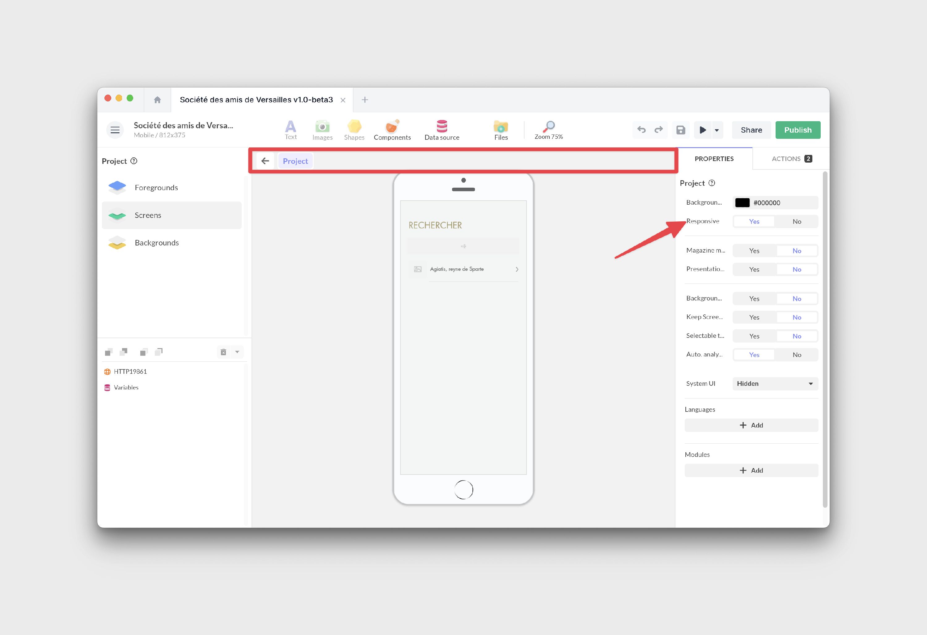
However, simply pressing this button won’t magically make your project responsive. You’ll need to set the responsive properties for each component within.
Responsive features of screens and objects
Understanding containers
Making a screen responsive is not a matter of adjusting each object one by one. It starts with a decision: which elements form a single unit, and should therefore be brought together. The Group exists for exactly this: it binds the elements that live and evolve together, the ones that must move, resize, and respond as one block. A card with its image, title, and button is one unit. A form field with its label and its error message is another.
The right instinct is therefore neither to leave everything independent, nor to gather everything into one large group, but to group by responsibility: one group per set of elements that acts as a whole. You end up with a hierarchy of containers, like nesting dolls, where each level manages its own adaptation. You set one level at a time: the screen first, then each container, then the objects within.
Containers act as “boxes” in which you place one or more objects. When responsive mode is on, each object inside adjusts based on that container’s properties, so its behavior depends not only on its own responsive settings but also on the container that holds it. A higher level can override what a lower one asks for: an object set to Stretch inside a screen or container in Aspect Fit still scales with that whole block instead of stretching on its own. So when an element does not adapt the way you expect, check the levels above it and work down, rather than only adjusting the object itself.
The primary containers in PandaSuite include: screens, Group, Scrolling area, Gallery, Multi-state, Drag & drop, Pop-up, and Flexbox.
Setting properties
Select an object and navigate to its properties.
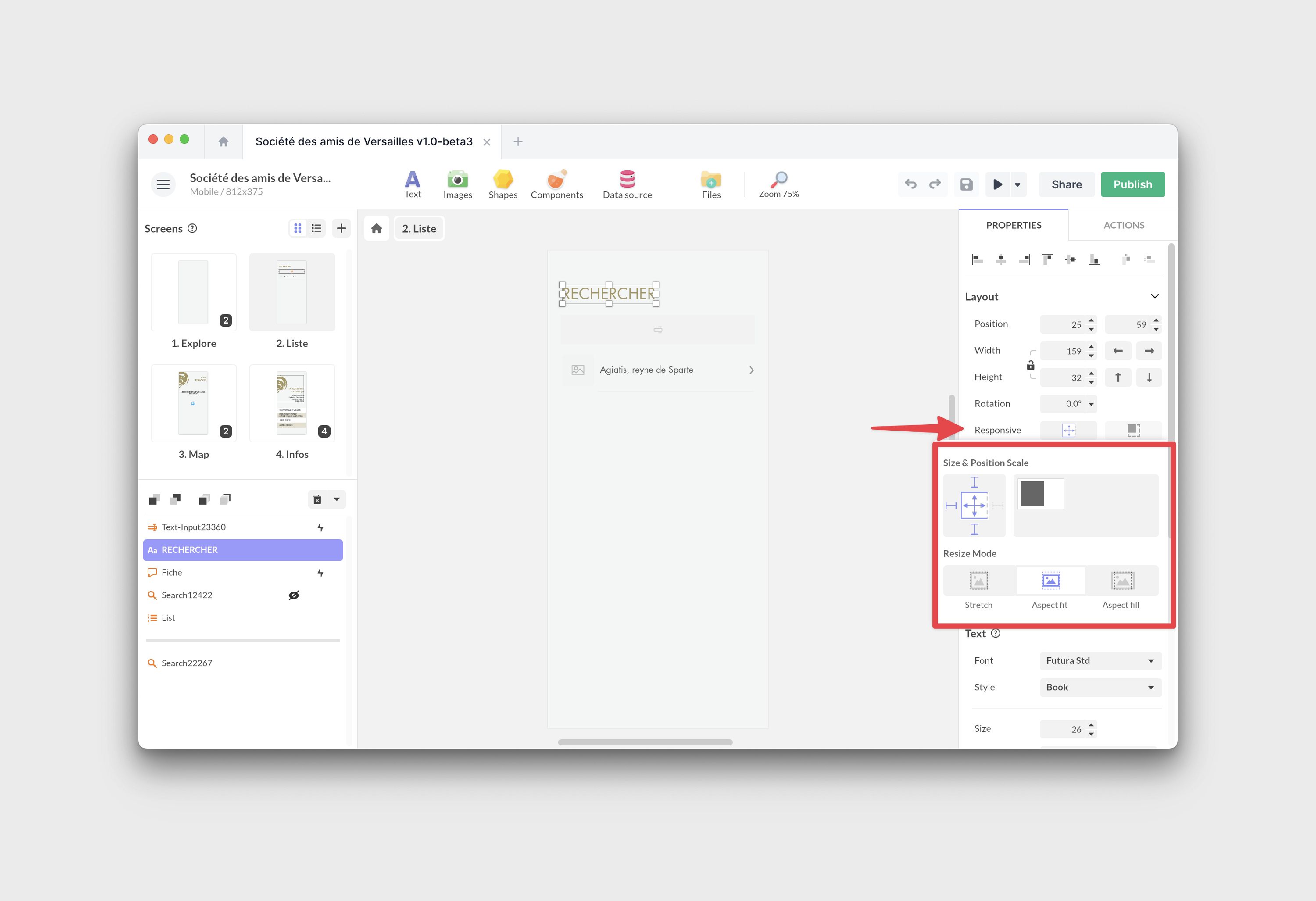
You can adjust two parameters: position and resizing.
Positioning
Using the pin feature, you can allow an object to move as the screen edge shifts. The object’s movement is based on the difference between its original size and the device’s size. Choose one or multiple directions for this movement.
If you pin an object to a non-opposite edge, the distance between the object and the edge remains constant. For instance, if your object is 100 pixels from the right edge and you activate the pin on this side, your object will always be 100 pixels from that edge.
Pinning an object to an opposite edge means its position will change to maintain the same proportion between the object’s center and the opposite edge. For example, a centered object will remain centered regardless of screen size changes.
Resizing
An object’s resizing is controlled by two arrows in the properties window. By default, both arrows are active, indicating that the object’s size changes proportionally with the project’s size.
For both horizontal and vertical resizing, you have three modes:
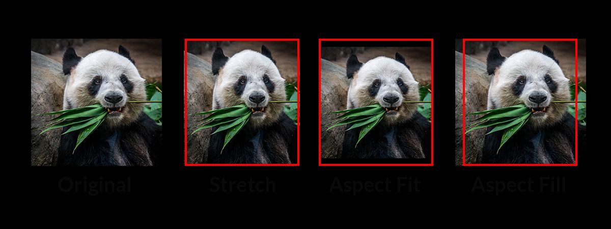
- Stretch: The object adjusts to fill all available space, which might distort it.
- Aspect Fit: The object resizes to fit the available space while retaining its original ratio, ensuring it’s fully visible without overflow.
- Aspect Fill: The object resizes to cover all available space, maintaining its original ratio, which might cause some overflow.
Turn an arrow off and that dimension stops being responsive: the object keeps the exact size you gave it, regardless of the screen. It will not grow on larger screens, and will not shrink on smaller ones, where it may overflow or be cut off. This is why a fixed size alone rarely gives a tidy column of content: a size only ever governs the object itself. To keep several elements aligned, evenly spaced, and repositioned automatically when one of them changes, place them in a layout container such as Flexbox rather than sizing each one by hand.
Default responsive behaviors
When responsive mode is enabled, objects follow a default behavior based on their type. Here’s a breakdown:
- Screens: By default, they’re set to Aspect Fit to ensure content remains visible and proportionate.
- Images: Care is taken to ensure images aren’t distorted. They adjust to the available space while keeping their original ratio.
- Text: Text might stretch or compress by default. To prevent this, use Flow Mode, which ensures text remains legible.
- Containers: They default to Stretch mode.
Choosing your screen’s mode
A screen’s own mode shapes everything inside it (remember the nesting dolls). Two of the modes keep your design’s proportions and scale it as a single block; the third adapts the layout to the device’s shape:
- Aspect Fit (the default): the whole design scales to fit inside the device, keeping its proportions. On a screen with a different ratio, empty margins appear around it.
- Aspect Fill: the whole design scales to cover the device, keeping its proportions. On a different ratio, the edges of the design are cropped instead.
- Stretch: the screen fills the device edge to edge without keeping proportions. The design no longer scales as one block; instead, each element follows its own position and resizing to suit the new shape. Choose Stretch for a full-bleed layout, or when you need to pin something to an edge (a bar, a header) and control a content area independently of it.
Rule of thumb: Aspect Fit and Aspect Fill keep a proportional design (with some margin or cropping), while Stretch lets you compose the screen edge by edge.
Diving into the Flexbox component
The Flexbox component is a cornerstone of responsive design. It’s a container that dictates the position of its child elements. This means if one child element changes in size, the positions of other elements adjust accordingly.
Flexbox offers a dynamic and adaptable layout. In PandaSuite, Flexbox adjusts based on its content, ensuring your design remains consistent and harmonious across all screen sizes.
Testing responsiveness
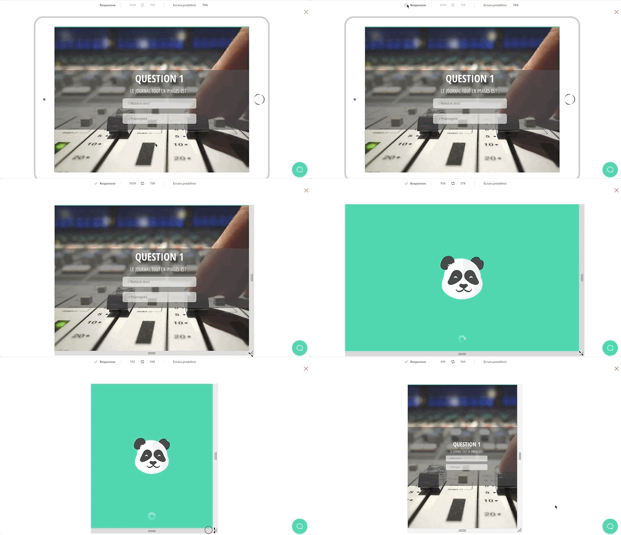
In the Preview, use the handles to resize your screens and observe the behavior across various devices.