Map
The Map component allows displaying a map in your application, creating markers (points of interest, areas) or displaying a route. This component relies on a map provider: Google Maps, OpenStreetMap, and Mapbox.
Google Maps, OpenStreetMap, and Mapbox are online mapping tools:
- Google Maps is the standard in this area.
- OpenStreetMap is a map of the world published for free under an open content license. Built by volunteer contributors, it is editable by anyone and constantly evolving.
- Mapbox is more advanced and offers numerous customizations of the map background. However, its use requires a subscription.
Displaying a map
Click on Components and insert the Map component.
In the Properties, choose the provider: Google Maps, OpenStreetMap, or Mapbox.
Double-click on the component within your workspace to display the map.
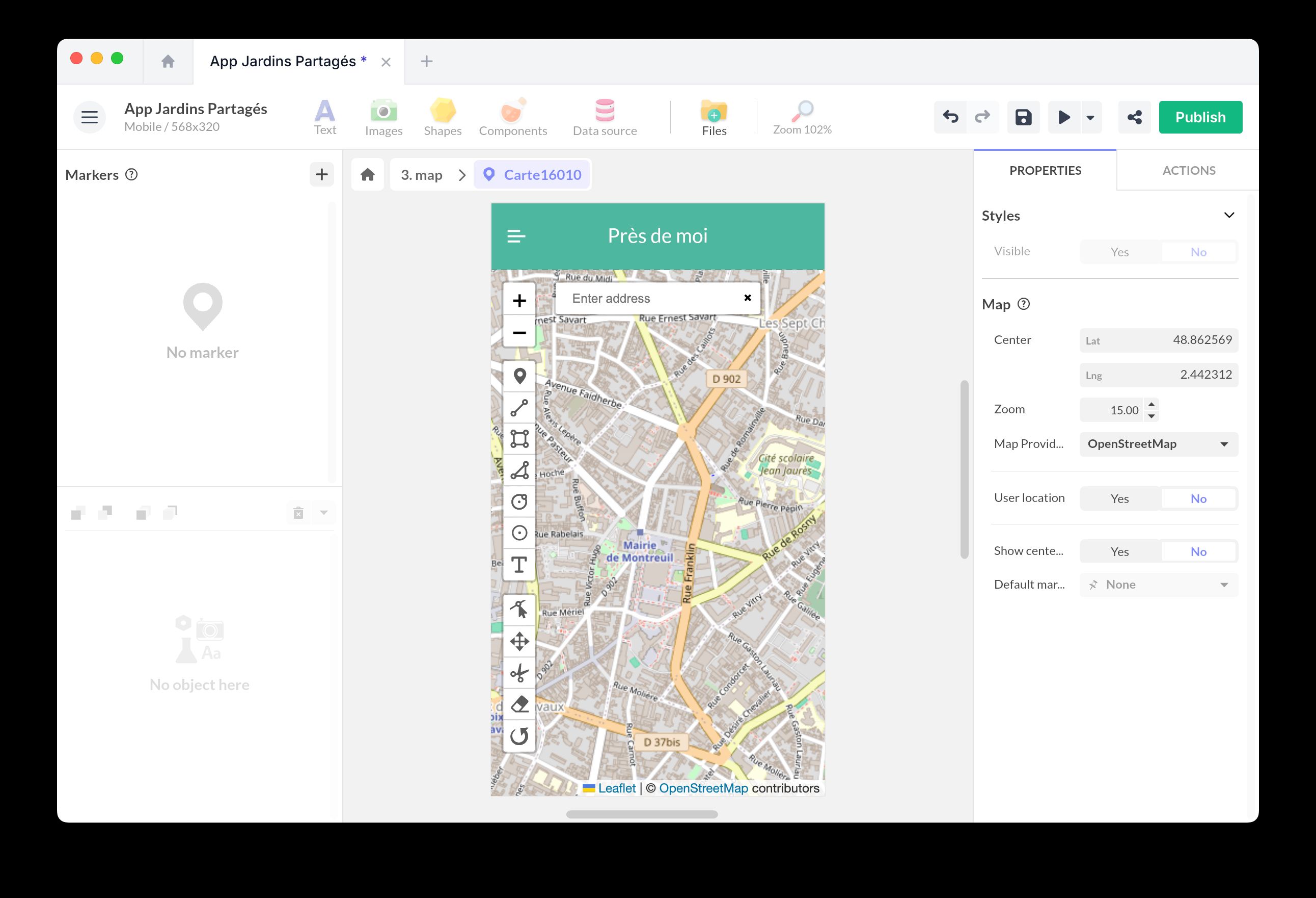
Enter the coordinates (Latitude and Longitude) of your map’s central point. Set the default zoom level.
Use Zoom min. and Zoom max. to define how far users can zoom out or in. These limits also constrain user interactions via the mouse, trackpad, or zoom controls.
Use Repeat world to control horizontal panning. When enabled, users can pan across repeated copies of the world, while map layers and markers remain available as the map wraps horizontally. When disabled, users stay within a single world map and cannot zoom out beyond the full world view.
If you choose Google Maps, it is necessary to insert your API key. For Mapbox, you must create an account beforehand and retrieve your Access Token to display the map. Learn more
With the User location option, you can refresh the map based on the user’s position. When it is enabled, use Map control to choose how the map follows the user: None, Just once, Always, Until pan, or Until pan or zoom. You can also choose whether to display the center pin with Show center pin.
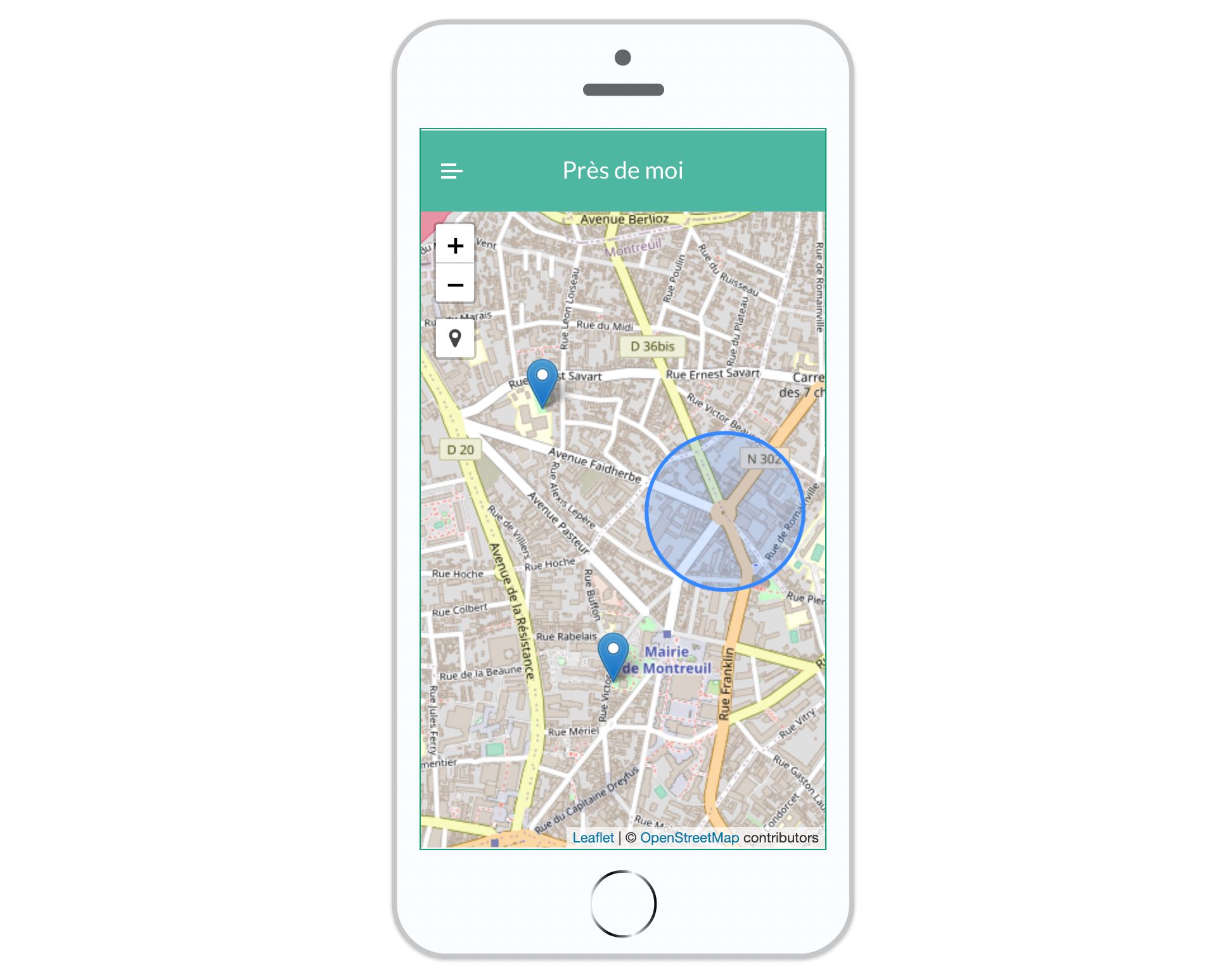
Adding markers and a route
You can create markers, points of interest located at a specific position on the map.
To create a marker, use the editing buttons that appear above the map. Select the type of marker (point of interest, rectangular or circular area) and click directly on the map to position it. You can also create paths to represent a route.
You do not need a database to add clickable markers. Place markers manually on the map and attach actions to each one (for example Open a pop-up, Go to a screen, or Open a URL).
When you create a marker, it appears in the left list.
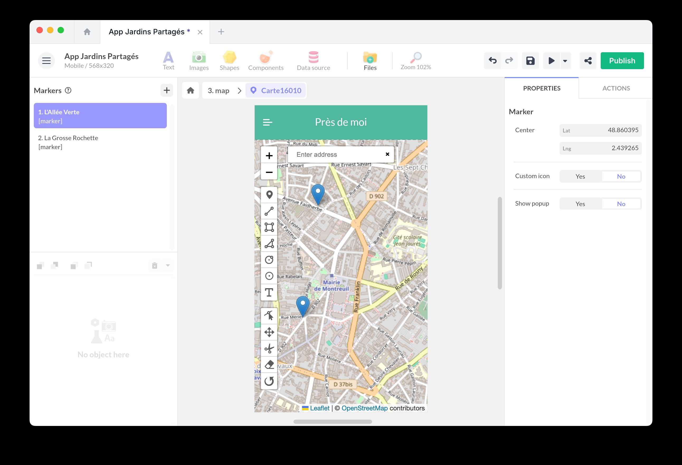
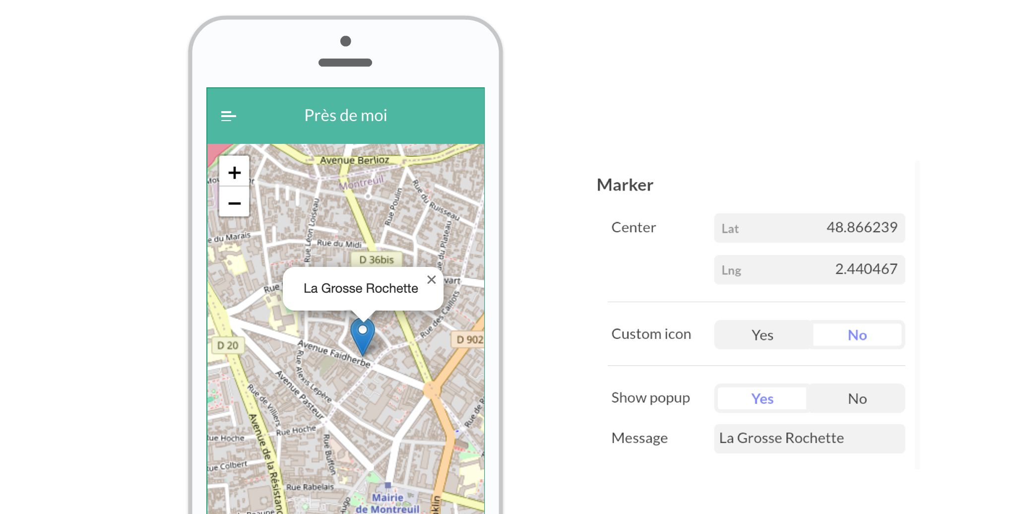
You can edit the properties of these markers:
- Choose whether the marker is Visible. This property supports data binding, so you can show or hide markers from a collection field or another component.
- Set its exact position (latitude and longitude).
- Customize the appearance of the icon: specify the URL of an icon, its size, and position.
- Choose whether you want to display a pop-up when clicking on the marker. You can customize the text.
For the appearance of markers, we use the Geopify service: you can customize the appearance and generate a new URL. You can also use any other service.
It is also possible to create markers dynamically from a data source.
This video explains how to create dynamic markers on an interactive map:
Create dynamic markers from a collection
Use this approach when you want to generate markers from structured data (for example a “Locations” list) and keep them easy to update.
-
Prepare your data
- Create a Collection in the Datastore.
- Add fields such as: Title (Text), Position (Coordinate), Icon URL (Text/Image), Description (Text).
-
Add one marker to the Map
- Insert the Map component and create a single marker.
- Select this marker and enable Dynamic Source, then link it to your collection.
-
Bind marker properties
- Add a data binding on the marker Center and bind it to your Position field (Coordinate type).
- Optionally bind other properties, such as Visible, the popup text (Title/Description), and the marker icon (Icon URL), to fields from your collection.
Associating actions with markers
Once your markers are created, you can use them to trigger an action.
Open the Actions window and select a marker from the list. Associate the action of your choice (for example, Go to a screen or Open a pop-up).
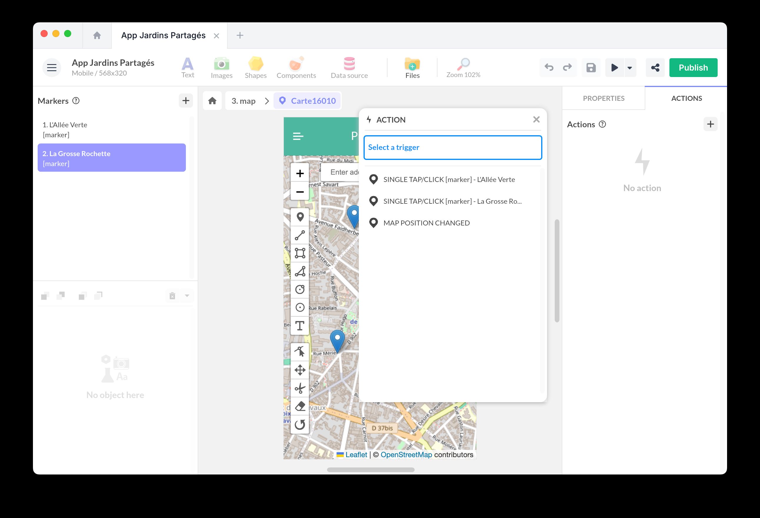
You can also use the marker action Focus to center the map on a specific marker.
Controlling the map with actions
Use the Map component actions when another interaction should move the map:
- Change map position changes the map center and zoom level.
- Fit bounds adjusts the view to include all visible markers. Use Vertical padding and Horizontal padding to keep markers away from the edges of the component.
Hidden markers are ignored by Fit bounds because they are not displayed on the map.
Exposed properties
The Map component exposes the following data for data binding:
- Center: current map center coordinates.
- Zoom: current zoom level.
Use the Map Position Changed trigger when you need to react after the user pans or zooms the map. The trigger exposes the new Center and Zoom values for the action flow.