Pop-up
A pop-up is a window that appears above the current screen, it usually contains contextual information. Customize the content of the pop-up and the actions to open/close the pop-up.
You can add a pop-up for a registration form, welcome message, error message, menu…
Create the pop-up
Click on Components and insert the Pop-up. Double click on the component to add the content of your pop-up.
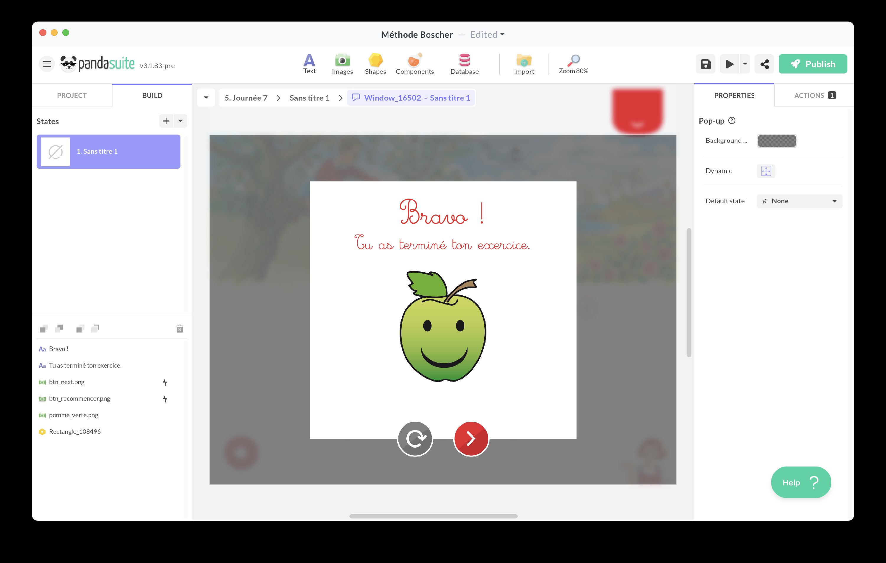
Insert any type of object: text, image, components etc.
You can choose the color of the Background and the transparency level.
You can create multiple states to animate your pop-up content.
The pop-up is automatically full screen. If you only want to display content on part of the screen, create a popover with the Multi-state component.
Open pop-up
By default, your pop-up opens automatically when you click on the transparent area: an action is automatically added. You can place it above your trigger, for example a button.
To open the pop-up differently, choose a trigger and the action Interact with a component > Pop-up > Open pop-up.
Close pop-up
By default, your pop-up closes automatically on click: an action is automatically added.
To close the pop-up otherwise, choose a trigger and the action Interact with a component > Pop-up > Close pop-up.
To improve the user experience, we recommend that you provide a cross in the top right corner that signals the closing of the pop-up to the user.