Understand components
Discover the power of components and what you can make with them.
Everything is component
In PandaSuite, each feature is represented by a component: Pop-up, Scrolling Area, GPS… This way each feature is flexible, customizable, and synchronizable with another feature. This is how PandaSuite gives you the most creative freedom. 🚀
Like Legos®, each component is composed in the same way, in the form of a common, abstract principle that allows the connection between them, without being specific to those same components.
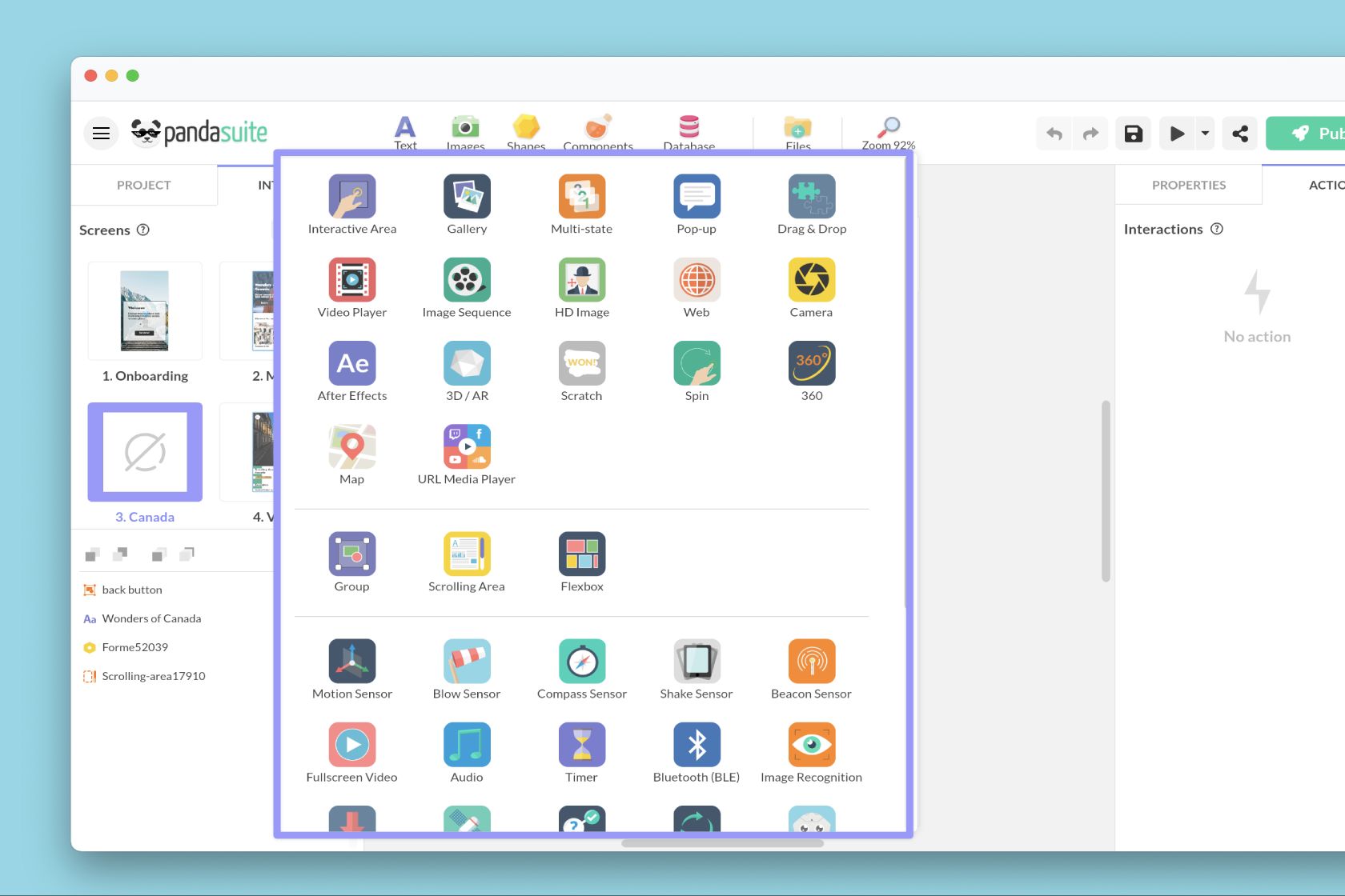
There are several types of components:
- Graphic components (HD Image, Drag & Drop…),
- Layout components (Flexbox, Group…),
- System components (GPS, Beacon Sensor, Motion Sensor)
- and Data components (Collection List, Authentication…).
You can add components anywhere you want in your application: in a screen, in a foreground and even at the project level. When a component is added at the Project level, it is active throughout the application (which can be useful for a Timer or the HTTP component).
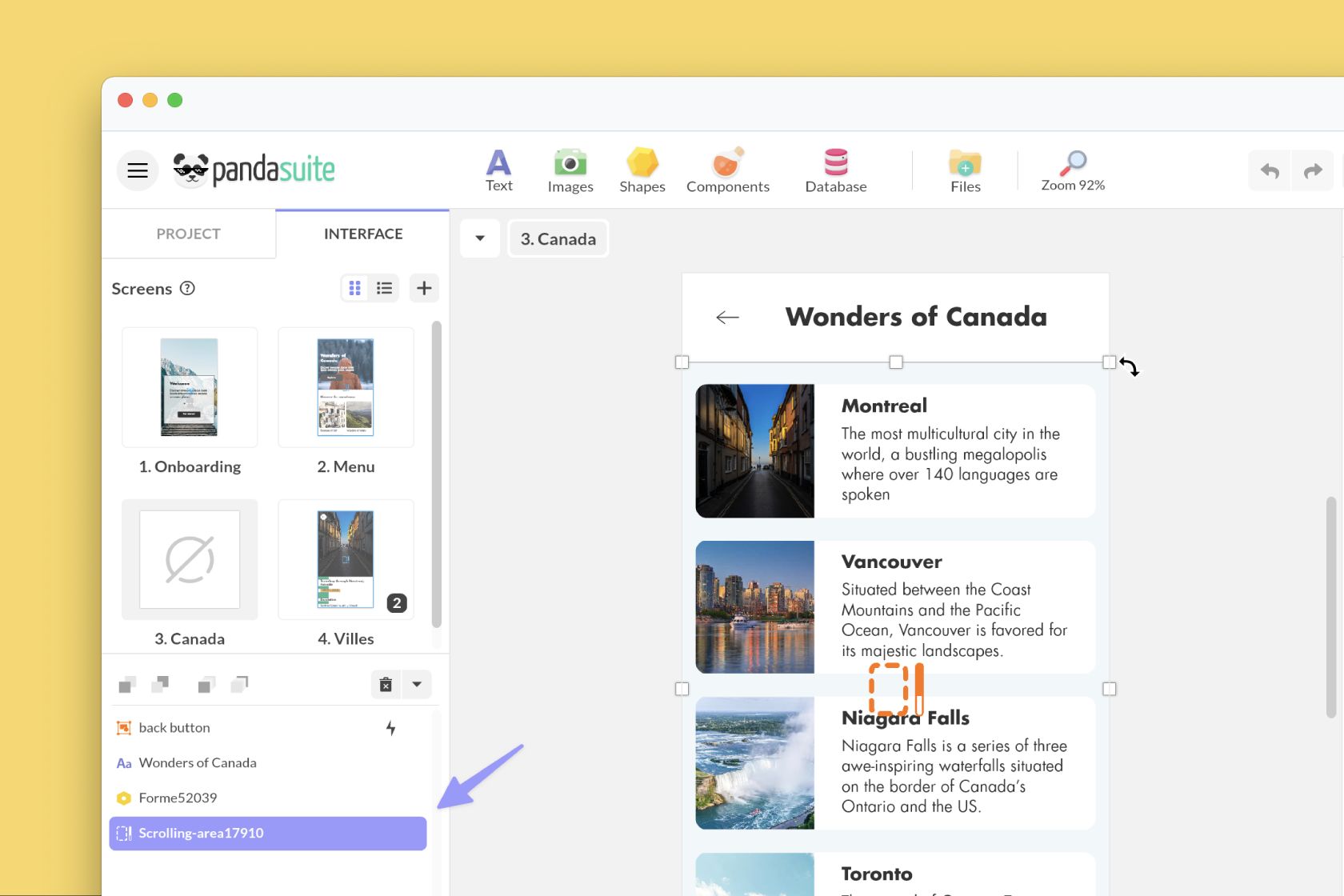
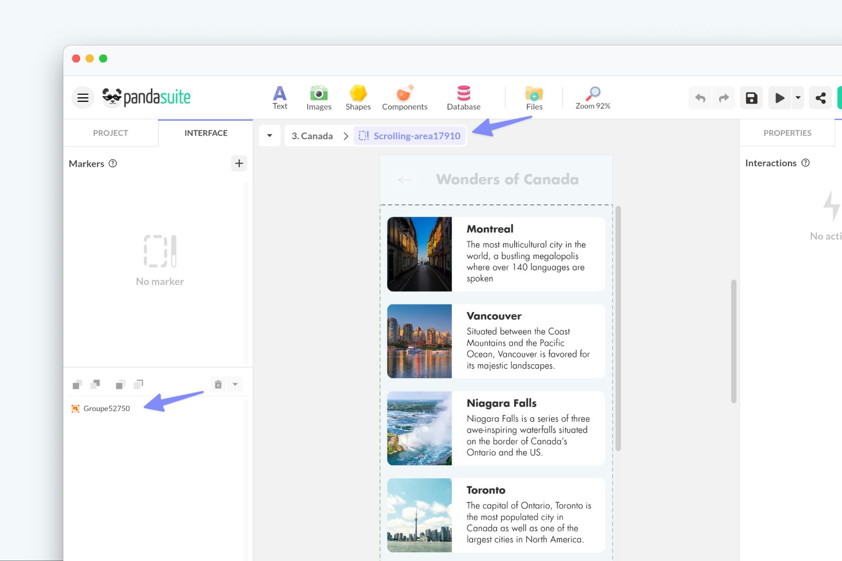
When you add a component, it appears in the Objects list at the bottom left. Non-visual components are isolated from other components by a separator and are placed at the bottom of the list. You can rename your components.
Characteristics of a component
Every component has the same characteristics:
- It has properties
- It has triggers to start an action
- It can be the target of one or more actions
- It is customizable using markers
- It can be synchronized with all other components
- It reacts according to languages
- It can receive data.
Edit a component
To edit the content of a component, you have to go inside this component: there is a notion of depth.
To go inside, double-click on the component. This component becomes the context. The breadcrumb trail, at the top of your screen, allows you to see where you are in your navigation and exit this component.
Inside a visual component, you can add all kinds of content: images, text etc. You can even add one or more components and create advanced nesting.
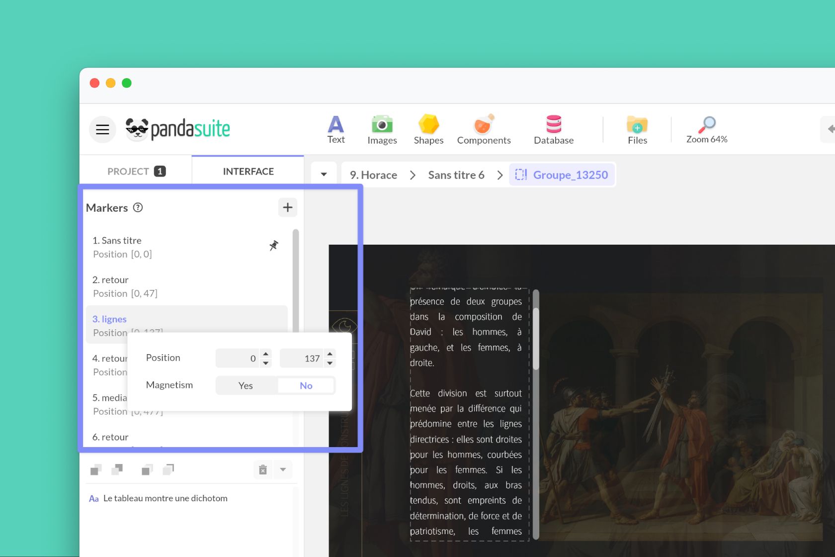
You can create markers on your components, i.e., identify one or more specific behaviors of this component and use it for an action. This can be the time of a video, a scroll position, a degree of tilt, etc.
Go to the left window to edit and manage your markers.
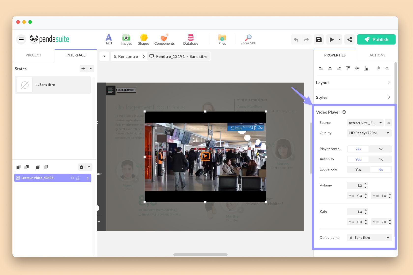
Properties of a component
The properties are specific to each component: source, autoplay, orientation, margin…
Edit the properties from the right window.
Actions of a component
Your component can be used as a trigger for an action.
To trigger an action from a component, select the component and click on Actions.
Choose a trigger event from the list: some events are specific to the component and others are common to all components.
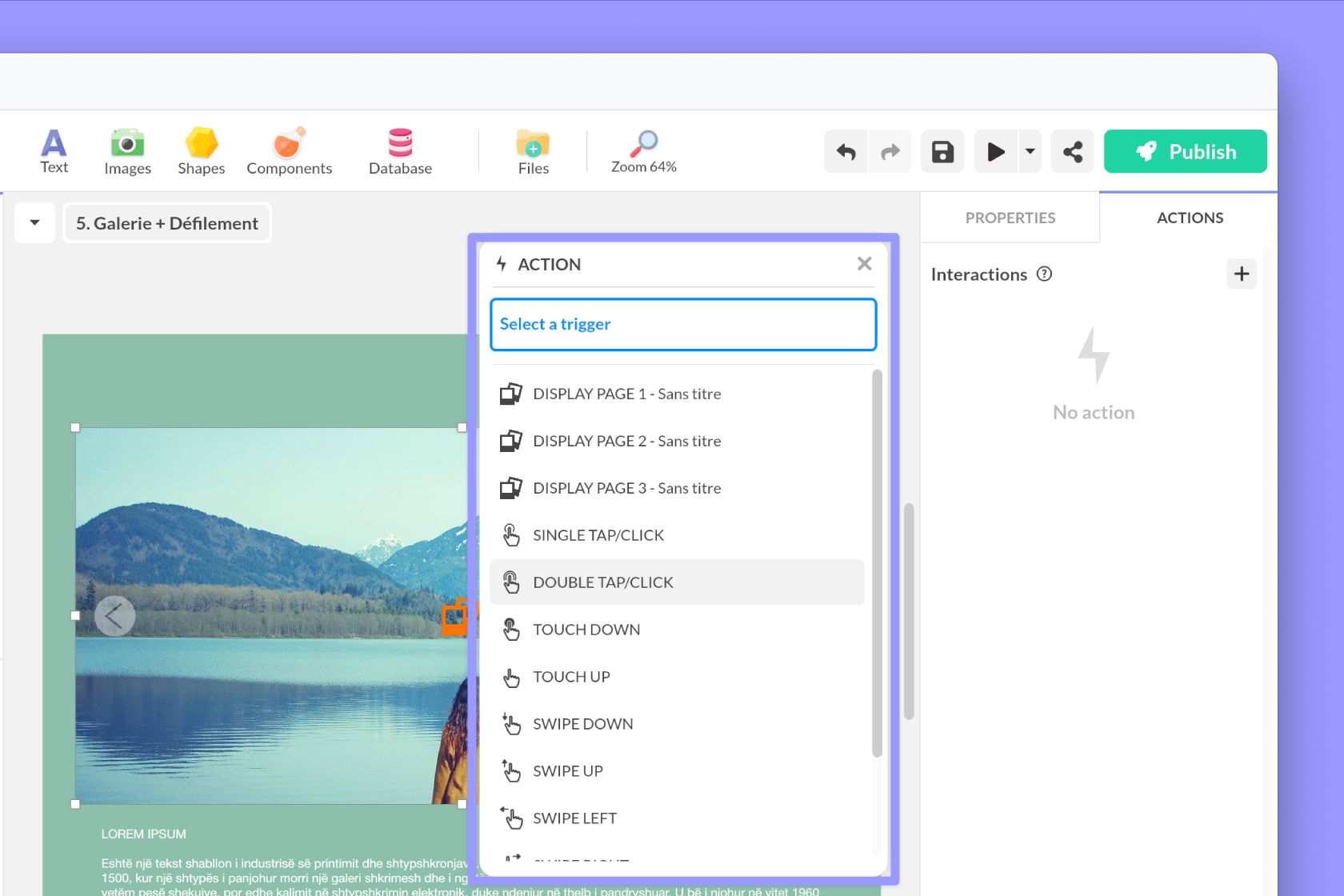
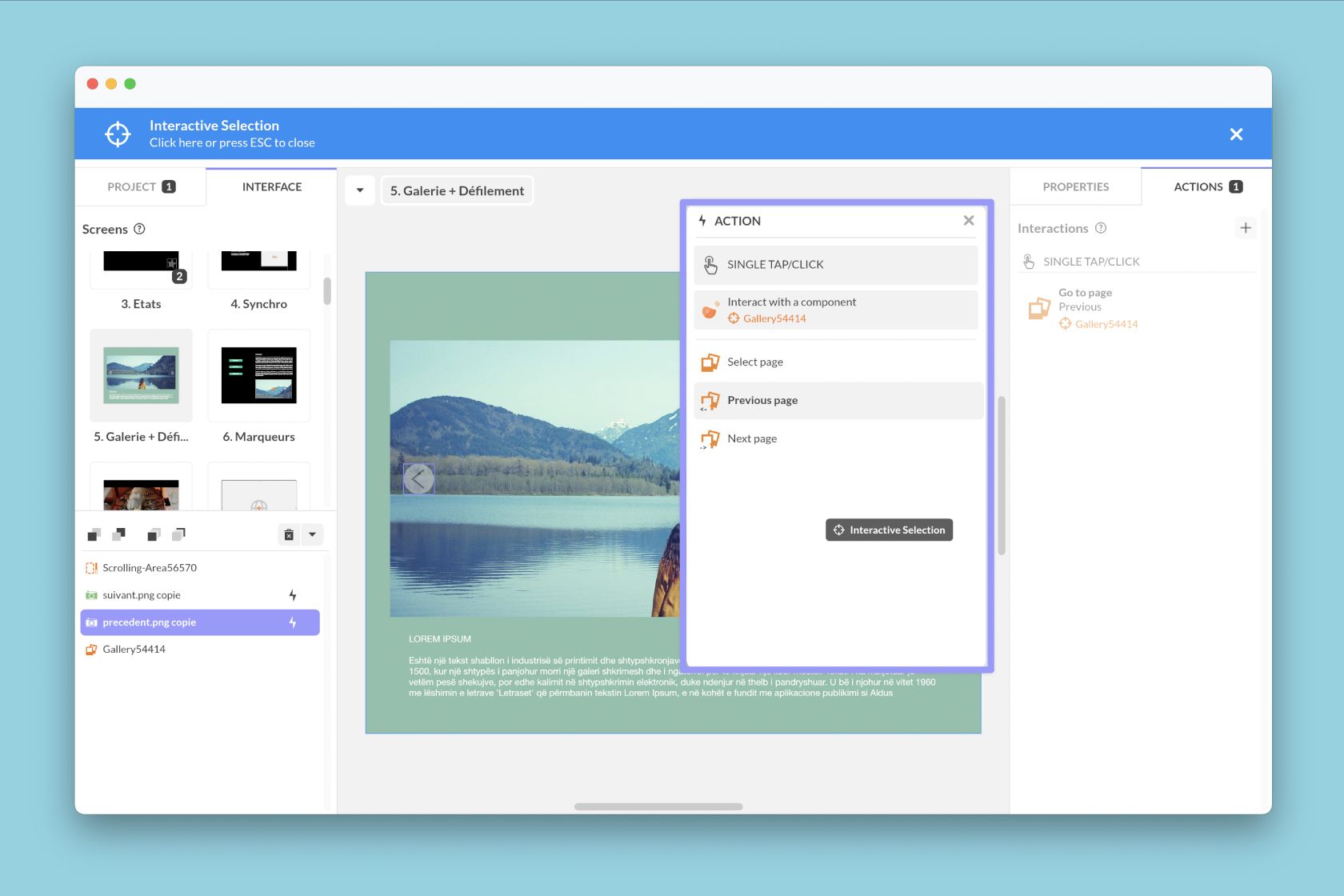
Your component can also be the object of an action. Once you have chosen your trigger event, select the Interact with a component action > select this component and choose an action.
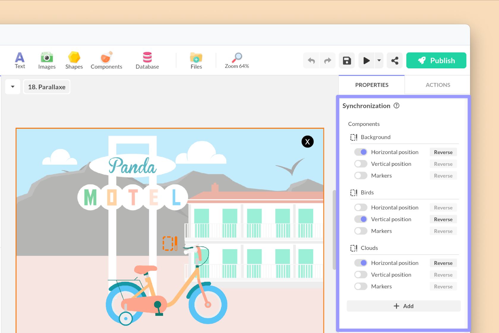
Synchronize components
Synchronization allows you to synchronize several components with each other. For example, you can synchronize an Audio Player with a Scrolling Area to scroll content according to the music. Or synchronize two (or more) Scrolling Areas together to achieve a Parallax effect.
Insert a Synchronization component and create a synchronization group with your components.
Create a custom component
If you are a developer and want to add new features, you can create your own Custom Components.
We provide you with our PandaBridge libraries (Javascript & React) that allow you to send and receive information between your code and PandaSuite.