Sidebar
The sidebar provides application-level navigation and quick access to top-level content collections in your application. Selecting an item in the sidebar allows users to navigate to a specific piece of content.
Create Sidebar
As with any navigation element, it is best to use the foreground to create the tab bar. This way the tab bar is persistent throughout the application and you can use the states to represent the selection of each icon.
Go to the foreground.
Design Sidebar
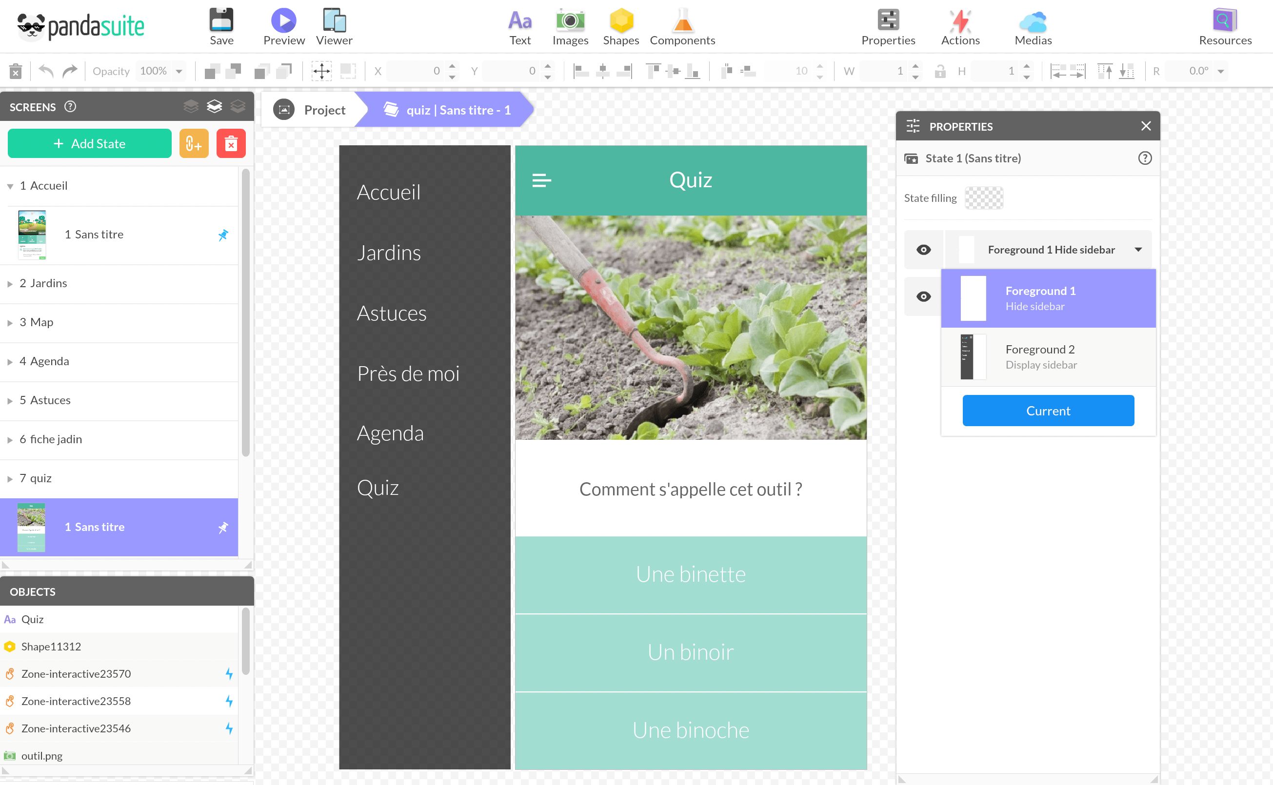
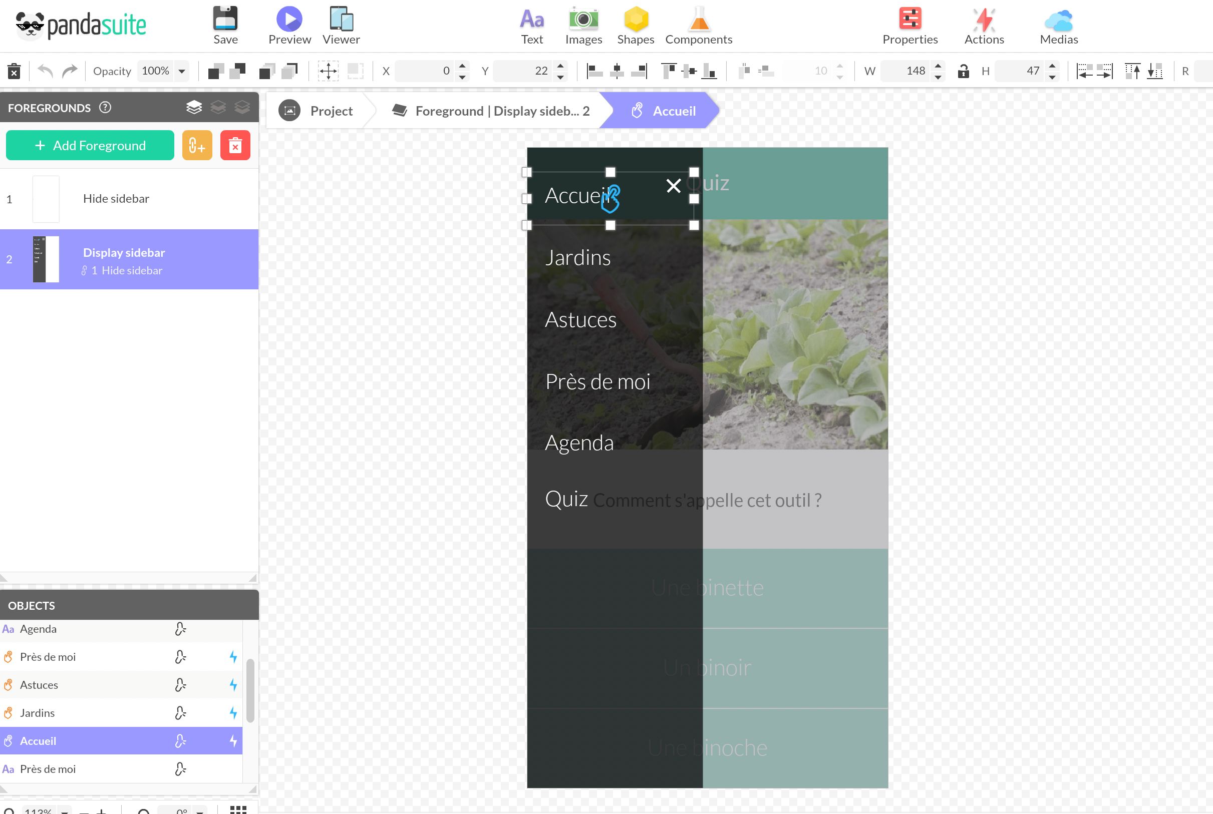
In the first state, prepare your sidebar when it is hidden. By creating a new state, you’ll create the opening effect of this sidebar thanks to the transitions.
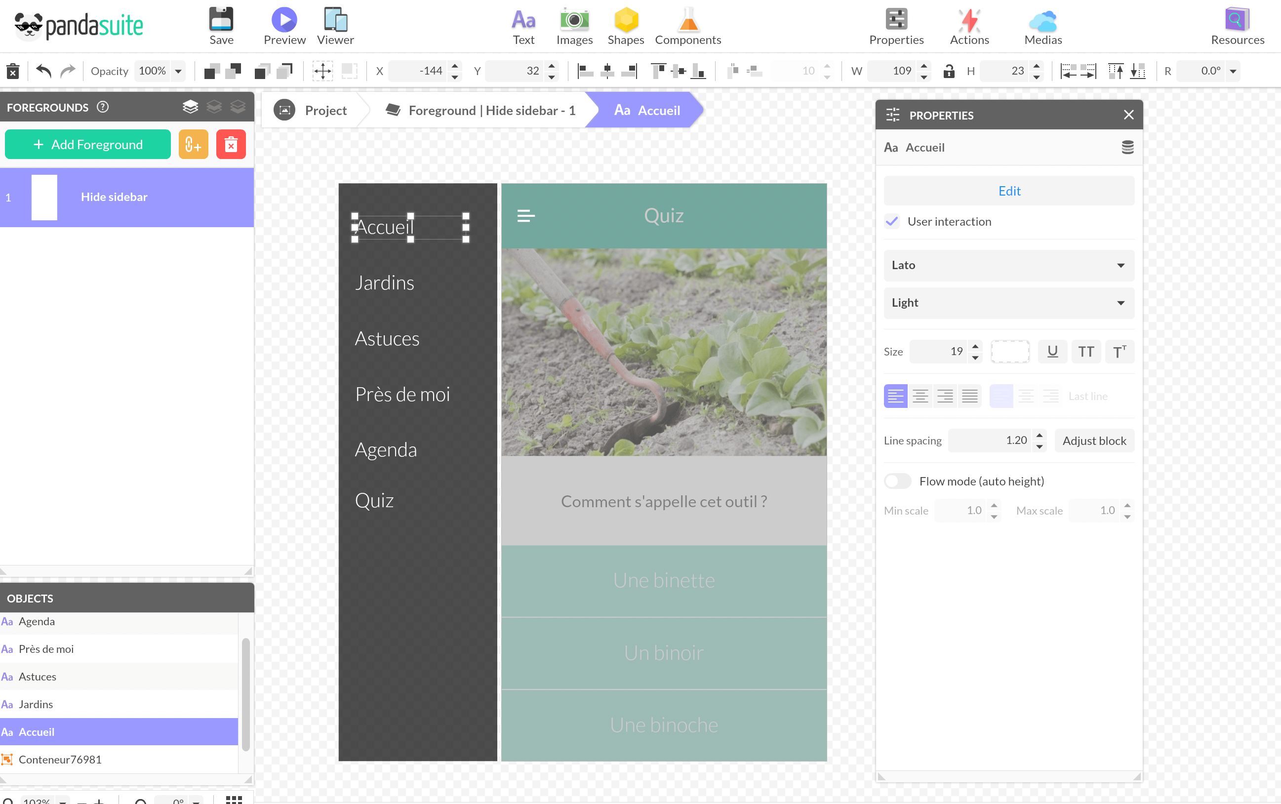
Import the graphic elements of your sidebar: the background bar and the icons (menu, close). For the background bar, you can use a Shape. Insert text blocks.
Create Link to Each Screen
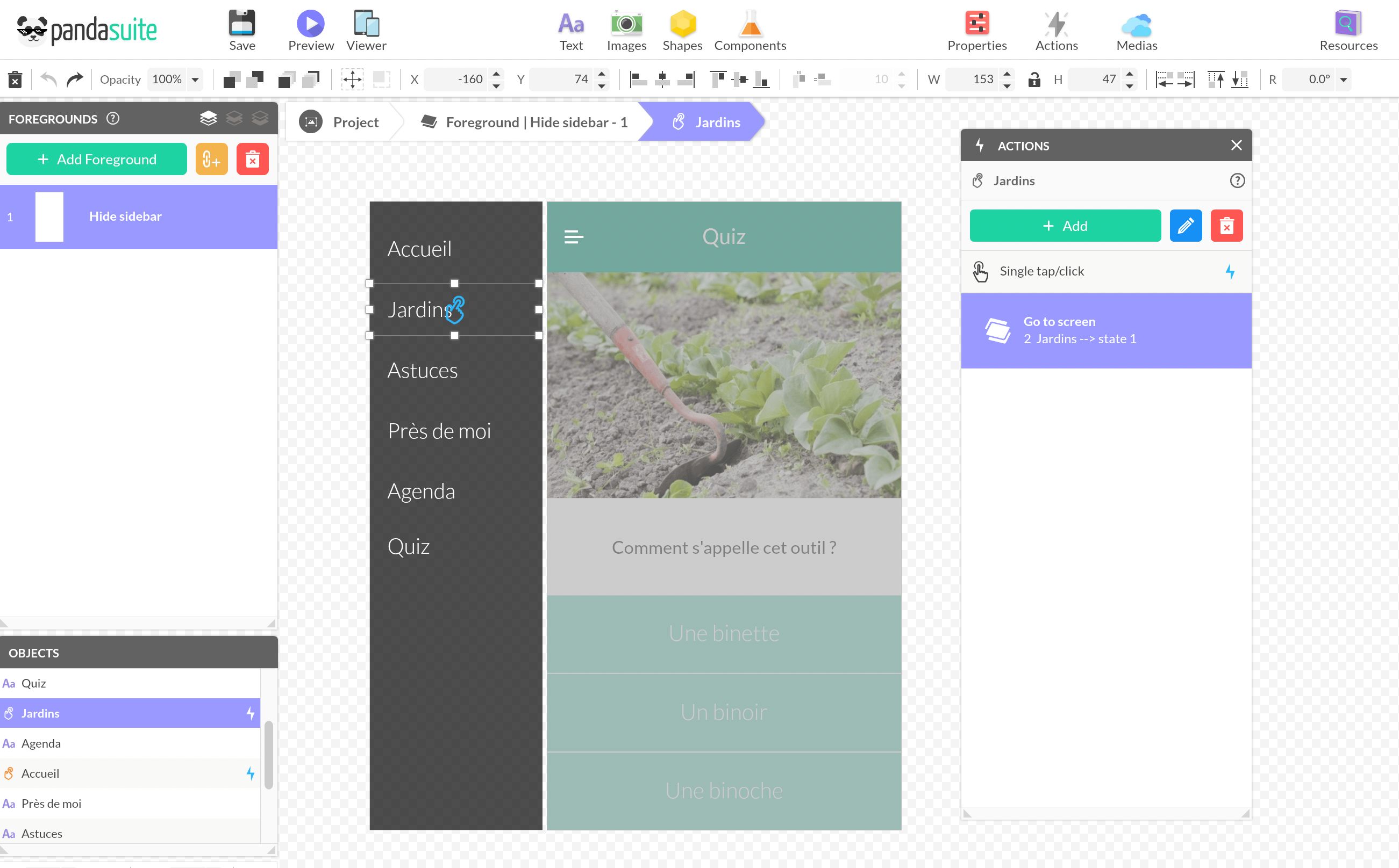
Above each text, add an Interactive Zone component, which allows you to expand the tap area. Link the Go to screen action to the right screen.
Create the Opening Effect of the Sidebar
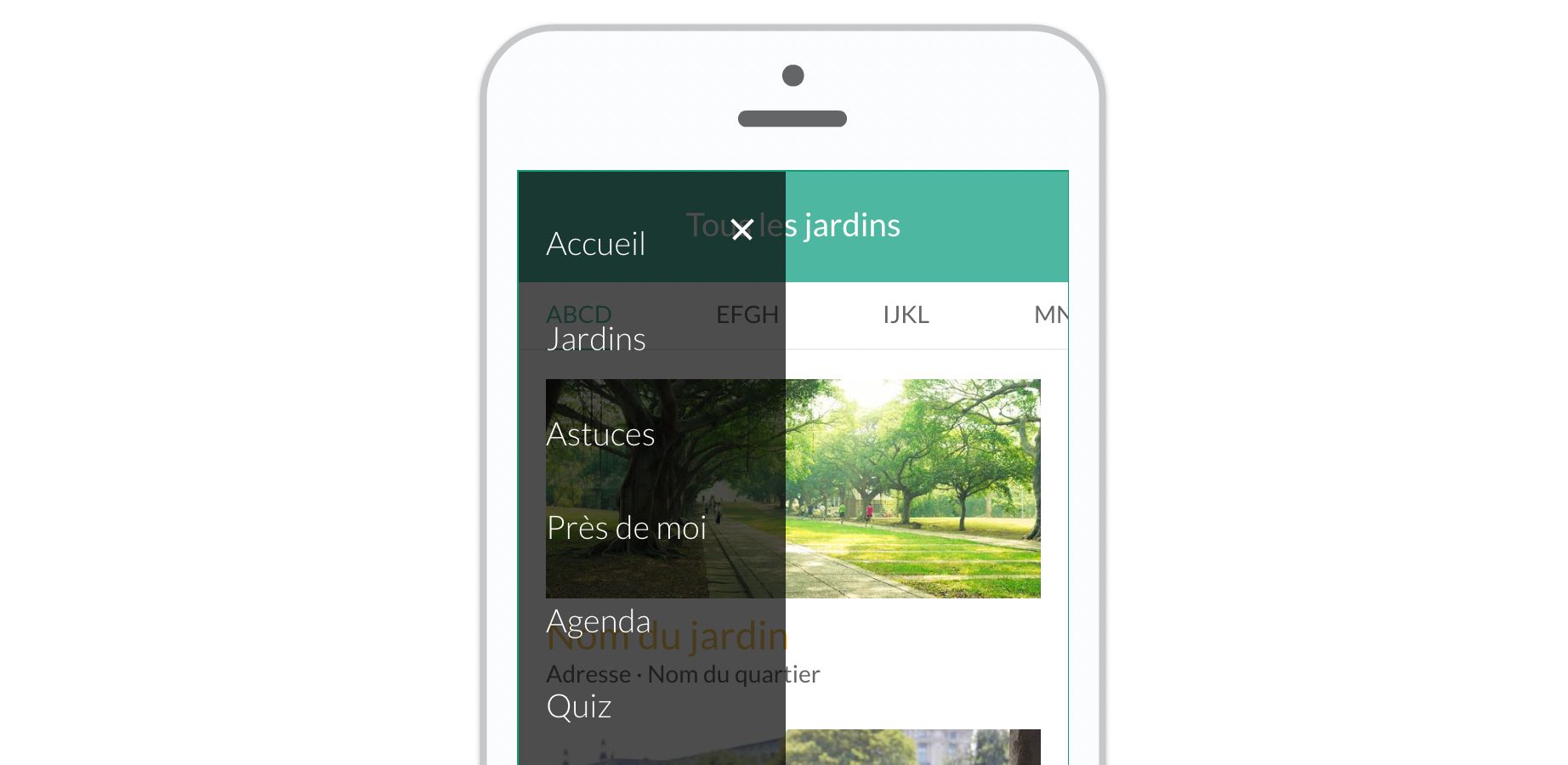
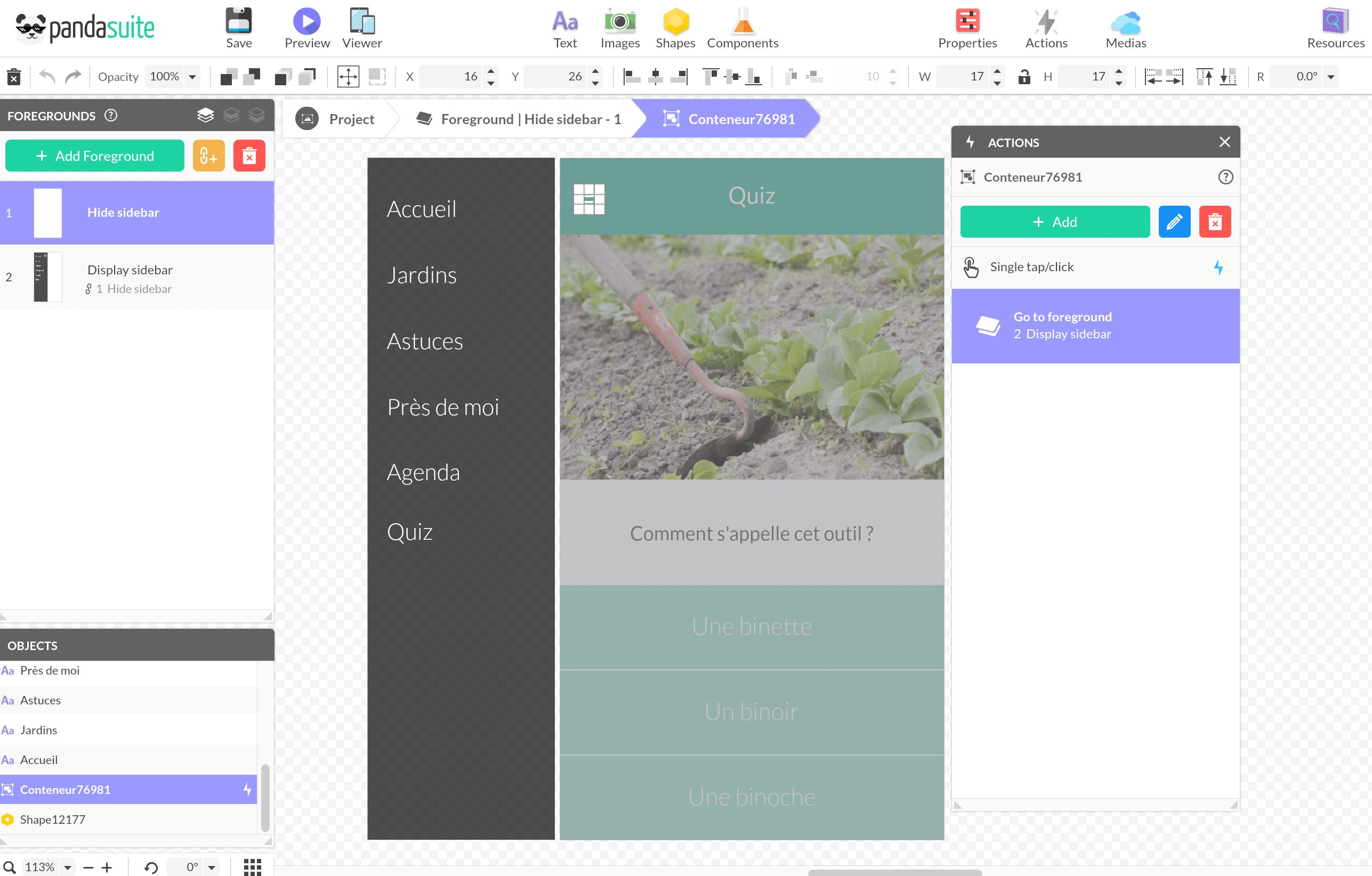
Create a new state linked to the previous one to keep the links and transitions. Move your sidebar elements to the left side of the screen.
Return to the previous state and select the menu icon. Create the Go to foreground > Display sidebar action.
Associate Foreground to Screens
At the screen level, go to the Properties window and select the foreground in which the sidebar is hidden. The sidebar can only be opened by clicking on the menu.