Transitions
Transitions help improve the smoothness and readability of the user experience by adding visual effects.
What is a transition?
A transition is an animation applied between two states. Transitions are only possible when using states, which are variations of the same component or screen. For example, if you have a button that changes color or a menu that appears, each version corresponds to a different state.
The transition animates the switch from one state to another.
Where can you find states?
States are a feature available in several PandaSuite components and elements:
-
Screens: you can create multiple states within a single screen, for example to manage different steps of an interface
-
The Pop-up component: you can create entry effects with different states of the same pop-up
-
The Multi-state component: allows you to group several custom states within the same container
-
Foregrounds / backgrounds: these areas can also contain multiple states
Add a transition
Once your states are defined, you can add a transition by modifying a property and creating an animation action.
-
Add at least two states (initial and final) to a component or screen.
-
In the final state, modify a property of the object: its size, position, opacity, mask, etc.
-
Create an action (click, hover, swipe…) that triggers the state change.
-
In the action options, enable the animation: you can define a duration (in milliseconds) and a type of animation (linear, ease-in, etc.).
Transition examples
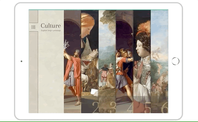
Logo on welcome screen
Here is an example of a transition on a welcome screen – it adds dynamism and modernity as soon as the app launches.
- Set up the initial state of your screen: insert the objects and design the layout.
- Open the Screens panel and click the orange button to create a linked state.
- In this linked state, change the layout of the elements.
- Choose the trigger for this transition in the Actions window:
- If the transition triggers automatically, select the state and the trigger On state display.
- If it is linked to user interaction, select the object and its event trigger.
- Choose the action: Change screen state > Go to next state. You can add a delay, a duration, an animation type, an interval, and enable loop mode.
Animated button on hover
- Insert a Multi-state component
- Set up the initial state of your button (yellow background)
- Click the orange button to create a linked state.
- In this linked state, change the button color (orange background)
- Select the component and choose the trigger Hover in.
- Choose the action: Act on component > Multi-state > Go to next state. You can add a delay, a duration, an animation type, an interval, and enable loop mode.
Types of transitions
You can create all kinds of transitions using states.
Fade in-out
To create a fade-in effect, modify the opacity of your objects. For example, set the object’s opacity to 0% in the initial state and 100% in the linked state.

Create a Fade-In Effect for a Logo Animation
Watch this video to learn more about the topic and see practical examples.
→ Watch the videoSlide
To create a slide effect, move your objects between the initial and linked states. You can also place them offscreen and combine with opacity to enhance the appearance.
Zoom
To create a zoom effect (for example on interactive maps), enlarge the object in the linked state.
If you want to create several zoom zones, create one linked state per zone. Then, place an Interactive Zone component and link it to the right state.
Mask (crop)
To create masking effects such as a fan menu, change the mask size between your states.