Add custom attributes
Custom attributes allow you to add extra information to your elements to make them accessible to screen readers and assistive technologies.
What is a custom attribute?
A custom attribute is a key/value HTML pair that you can add to any element to give it additional meaning or role.
Example:
Aria Label = “Button to access the main menu”This allows you to add properties directly into the HTML so that screen readers can better understand the structure and function of your elements.
Why use ARIA attributes?
ARIA (Accessible Rich Internet Applications) is a set of standardized attributes that allow you to:
- Describe an element (e.g.,
Aria Label,Aria Describedby) - Hide an element (
Aria Hidden= “true”) - Define its role (
Role= “button”,Role= “alert”, etc.) - Notify dynamic content changes (
Aria Live)
These attributes help screen readers better interpret the structure and behavior of your interactive content.
Adding a custom attribute in PandaSuite
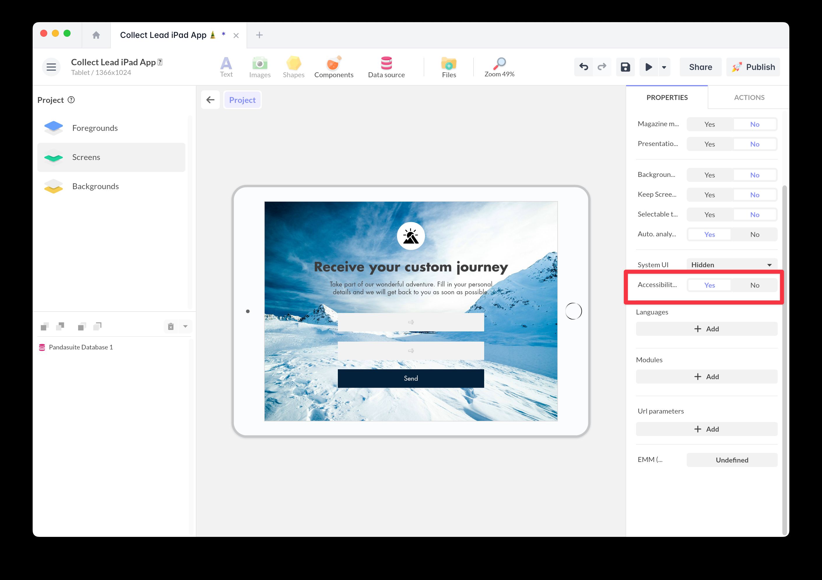
- Go to the project properties and enable the Accessibility option
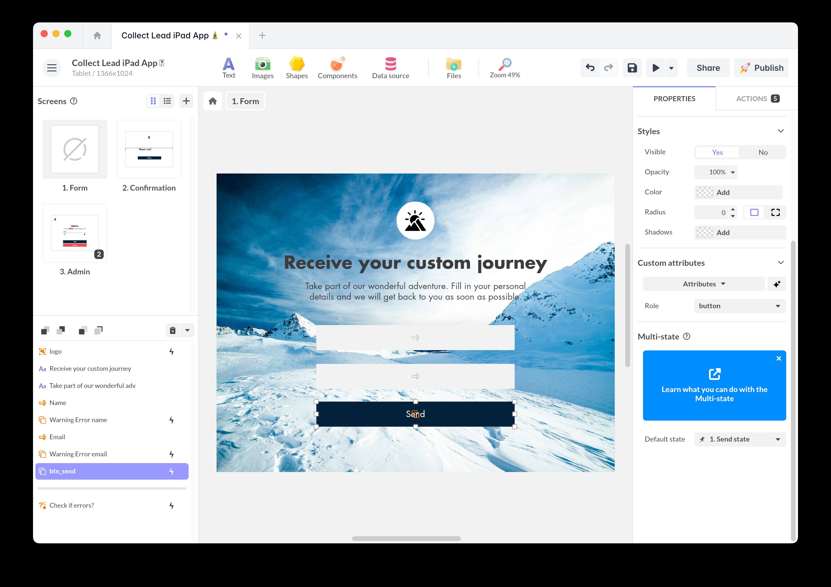
- Select the object to which you want to add an attribute
- In the right-hand panel, open the Accessibility section
- Click on Add a custom attribute
- Fill in:
- Name: for example
Aria Label - Value: for example “Main menu”
- Name: for example
You can add multiple attributes per element.
The Magic button allows you to automatically add accessibility properties when logical. For example, when a “click” trigger is present on an element, it will automatically assign the role "button".
Examples of attributes
| Attribute | Description | Example |
|---|---|---|
Aria Label | Gives a name to an element | ”Back to home” |
Aria Hidden | Hides an element from screen readers | ”true” |
Aria Describedby | Associates a description to an element | ”description-id” |
Role | Defines the role of an element | ”button” or “navigation” |
Aria Live | Indicates dynamic content updates | ”polite” |
Useful accessibility attributes
Alt: Provides a textual alternative for visual content, like an image.Title: Specifies a tooltip or additional information for the element.Tabindex: Defines the keyboard navigation order for the element.Role: Declares the semantic role of the element for assistive technologies.Focusable: Indicates whether the element can receive keyboard focus.Lang: Declares the language of the content to aid assistive tech interpretation.
Other common ARIA attributes
Here’s a more complete list for advanced use:
Aria Activedescendant: Identifies the active element within a managed list.Aria Atomic: Indicates whether content should be treated as a whole during updates.Aria Autocomplete: Enables or disables auto-completion to anticipate user input.Aria Busy: Indicates whether an element is currently busy or updating.Aria Checked: Specifies whether an element is checked: true, false, or mixed.Aria Colcount: Defines the total number of columns in a grid or table.Aria Colindex: Indicates the column index for a cell in a grid.Aria Colspan: Specifies how many columns a cell should span.Aria Controls: Identifies one or more elements controlled by the current element.Aria Current: Indicates whether the element represents the current item within a set.Aria Describedby: References elements that provide additional description.Aria Details: Associates the element with additional detailed information.Aria Disabled: Indicates that the element is disabled and not interactive.Aria Dropeffect: Specifies the visual effect of a drag-and-drop operation.Aria Errormessage: Provides an error message when validation fails.Aria Expanded: Indicates whether a section or menu is expanded or collapsed.Aria Flowto: Defines a custom navigation order between elements.Aria Grabbed: Indicates if the element is currently grabbed for dragging.Aria Haspopup: Indicates the presence of a related popup element or menu.Aria Hidden: Specifies if the element is hidden from assistive technologies.Aria Invalid: Indicates the value of an element does not meet expected constraints.Aria Keyshortcuts: Defines keyboard shortcuts that activate or focus the element.Aria Label: Assigns a descriptive textual label to the element.Aria Labelledby: References elements that label the current element.Aria Level: Defines the hierarchical level of an element in a structure.Aria Live: Indicates the importance of dynamic content updates.Aria Modal: Signals that a modal window has captured the user’s attention.Aria Multiline: Indicates that a text input field supports multiple lines.Aria Multiselectable: Specifies whether multiple items can be selected.Aria Orientation: Defines the orientation (horizontal or vertical) of an element.Aria Owns: Declares ownership relationships between elements.Aria Placeholder: Provides hint text for an input field.Aria Posinset: Indicates the position of the element in an ordered set.Aria Pressed: Represents the pressed state of a toggle button.Aria Readonly: Indicates that the element is read-only and cannot be modified.Aria Relevant: Defines what types of changes should be announced.Aria Required: Marks an element or field as mandatory.Aria Roledescription: Provides a custom description for the element’s role.Aria Rowcount: Defines the total number of rows in a grid or table.Aria Rowindex: Indicates the row index for a cell.Aria Rowspan: Specifies how many rows a cell should span.Aria Selected: Indicates whether an item is selected within a group or list.Aria Setsize: Defines the total number of elements in a set.Aria Sort: Indicates the sorting order applied to a column.Aria Valuemax: Defines the maximum value for a range control.Aria Valuemin: Defines the minimum value for a range control.Aria Valuenow: Indicates the current value of a range widget.Aria Valuetext: Provides a text alternative for the current value.